|
My experience throughout this phenomenal year in art was extraordinary. I met so many new people and made new friends that helped me develop skills I didn't know I had. I've really enjoyed all the art I was able to create because of my friends endeavors to help me become the artist I am today. Although I suffered scrutiny with all my technicalities, I still enjoyed every bit of it. Our table may not have been the most productive, but we sure had a blast cracking jokes and laughs. Art's not always about the deadline, it's about the experience as well. If it weren't for my peers and a wonderful teacher, yeah I still would have got my work done, but there wouldn't be that spark that so many people find in my art. I'm glad I chose to sit with my friends and do what I do best.
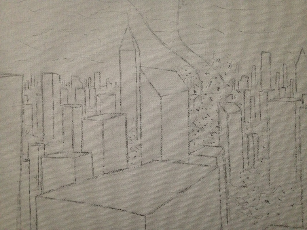
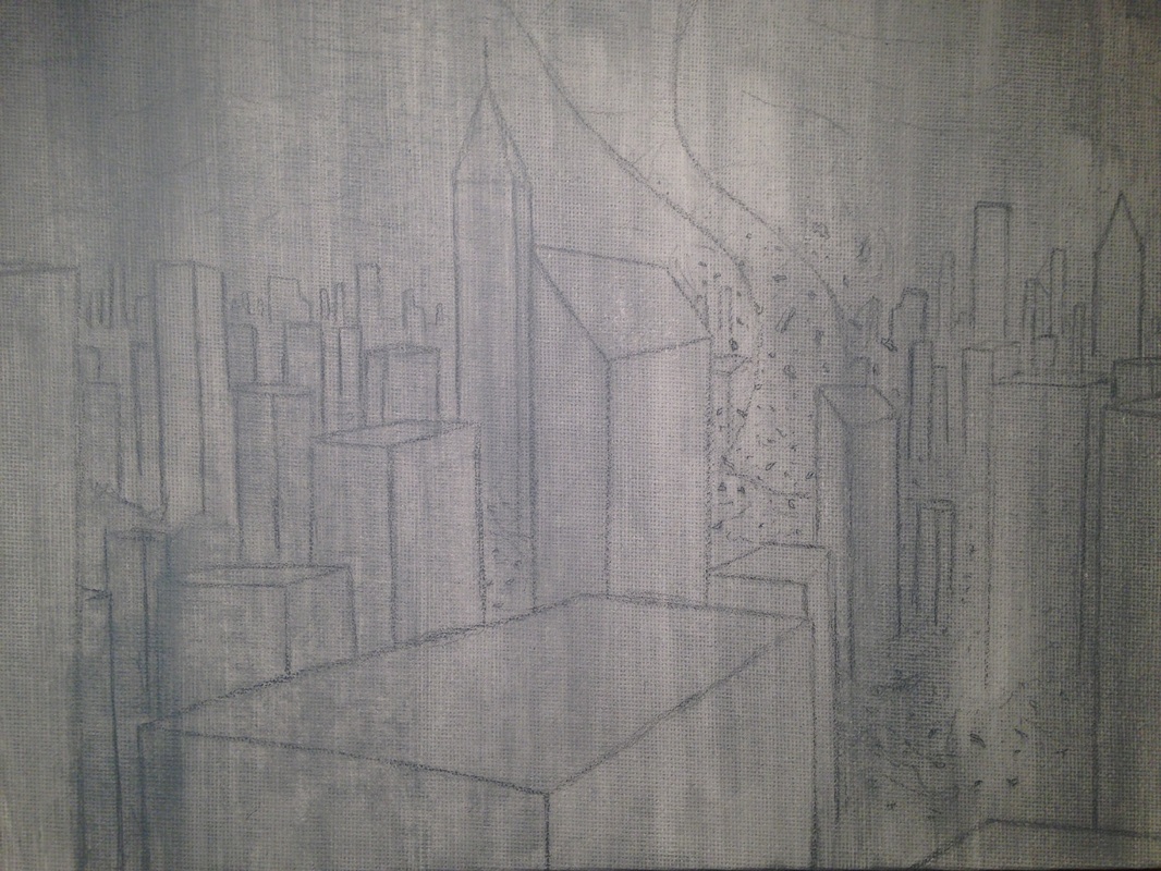
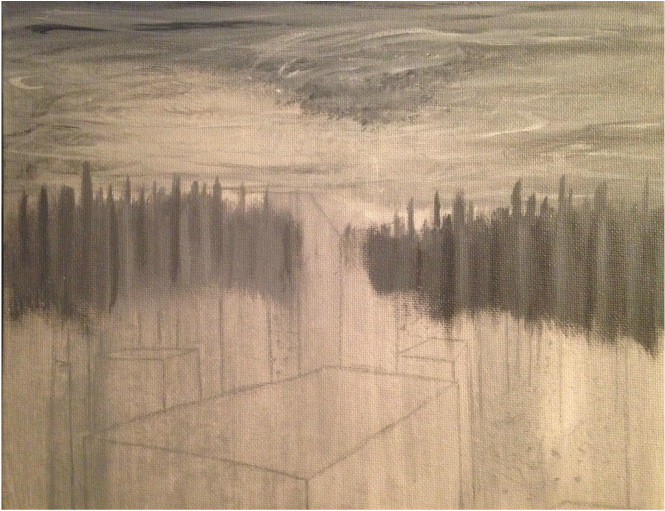
"It's been...educational." -Marty McFly, Back to the Future. My art has definitely changed over the years and I know that was because I had observed my peers and learned from their style, how I could develop one of my own. My brilliant teacher, Ms. Rossi, has been my light down this dimly-lit hallway the past two years. She proved me guidance when there was otherwise no hope. The past two years are the years I have grown the most, and without her I think I would still struggle to create appealing artwork. I'm definitely going yo miss her, not only is she one of my favorite art teachers, but one who takes time of her own to be sure you know what your doing and feel confident in yourself to continue your work. Not many teachers do this and that's what makes her top of the department. Throughout the first semester of this year I kept pondering of new ideas for concentrations, but I don't think I was grasping the concept of them yet. Concentrations are supposed to be more "in-depth," and by that I mean including a theme that the viewer will understand when he/she looks at the art. It wasn't until Christmas time that I finally developed a concentration doable for an artist of my technical needs. After Ms. Rossi taught our class about what concentrations should demonstrate, I formed an idea. My concentration was the development of "destruction" in everyday life, but in ways that revolved around time and change. I included some manmade elements as well as natural, this illustrated the influence around our society today. This theme was a bit more in-depth than most of my other classmates, and I think I wanted that. My whole point was to get the viewer to realize what we go through in life and to not be depressed, but become stronger and stay confident. In a way I think my concentration reflects on me in ways that I believe show that I have a strong willpower. Staying strong and standing keeping it together is all part of the journey to get where you want to go in life. Giving up is easy but won't bear your fruit in the end. Hopefully this idea is somewhat present, and my viewers understand the deeper meaning of my work. My breadth was a collection I enjoyed creating. There were many aspects I learned over the summer that helped me throughout my thought process in creating my breadths. I really tried to explore new mediums to create art with better style. Throughout the year I repeated using some of those mediums and got better on managing those skills. Aside the fact of mastering my marksmanship, working on my breadths also helped me compare my work to my classmates. There's not much else to explain about this, but they were really fun to create and make better. Overall this course is by far my favorite out of all the classes I've taken in high school. Thanks to all who helped me become who I am.
0 Comments
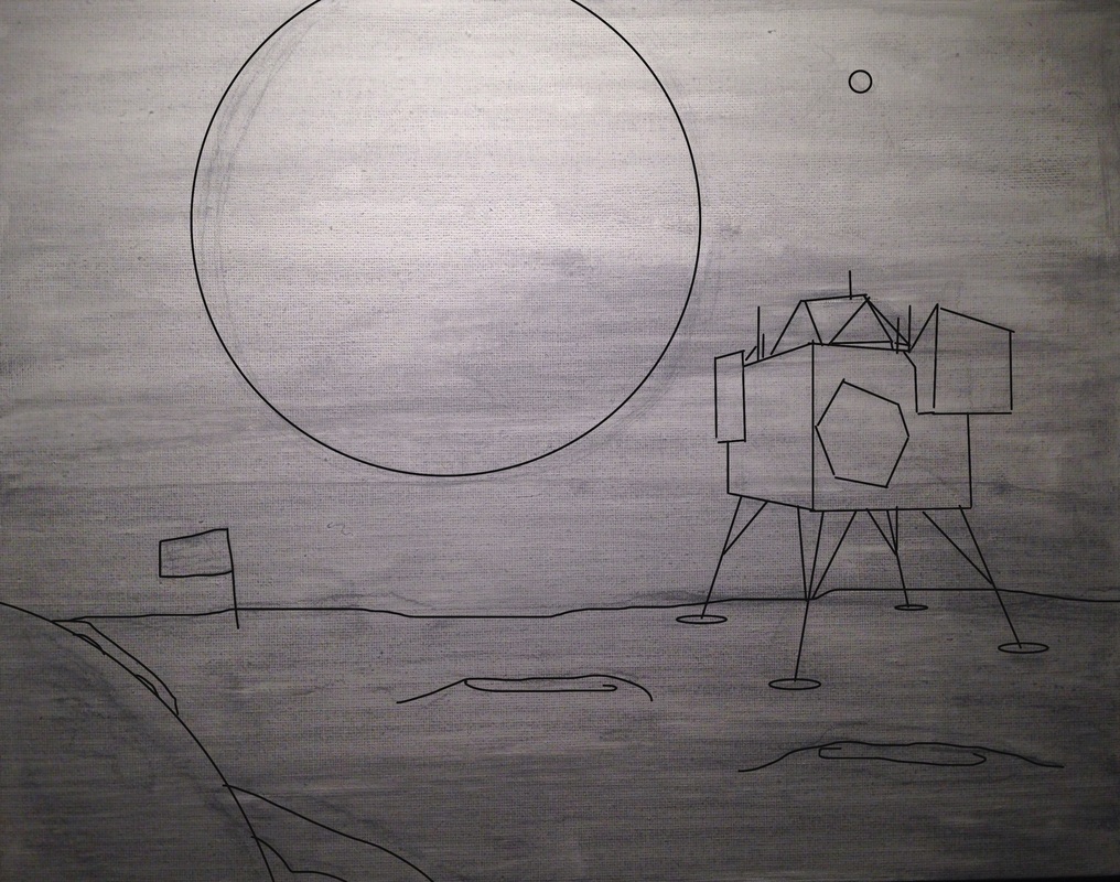
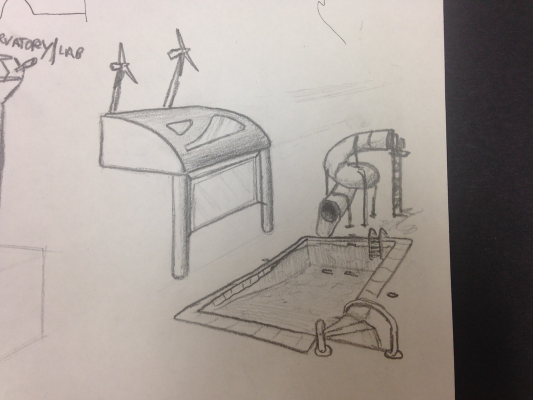 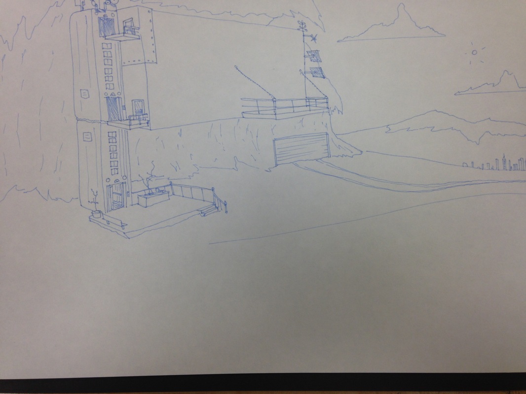 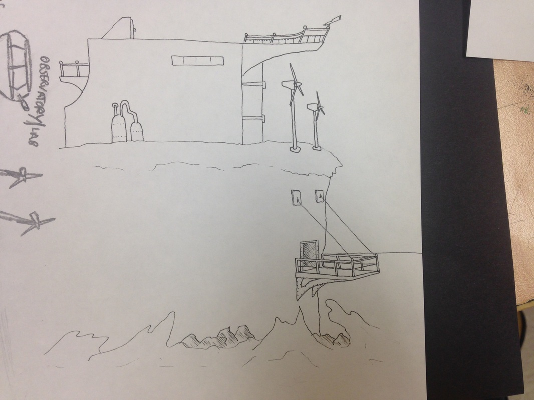  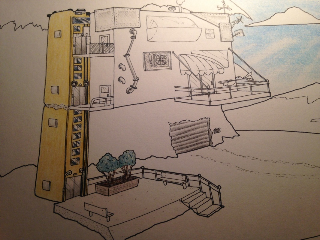 Now this is one of my favorite mediums, colored pencil and ink, just like the coloring books, except with more detail. I've made other works in this same medium of which I am proud of. I'd be happy to make the rest of my pieces from this medium because I find the most enjoyment out of it. That and it's one of my quality art techniques that does not consume time as a result (well not as much as some of my other choices). The purpose of this project was to create a type of architecture (building) that is made in your own style. This style or design has to be something that reflects on the artist (me) and creative at the same time.
I chose the 'hideout' typed structure that is made from scavenged parts and what seems to be junk. I think this represents me because I have the tenacity to build and create things of my own, out of nothing. Essentially like MacGyver. This building has lots of functionality that would serve me very well. I like to think of myself as an innovator and an inventor, who finds things that could be used to an advantage. I find this to be a very defined skill that I have. 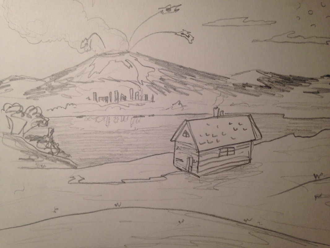 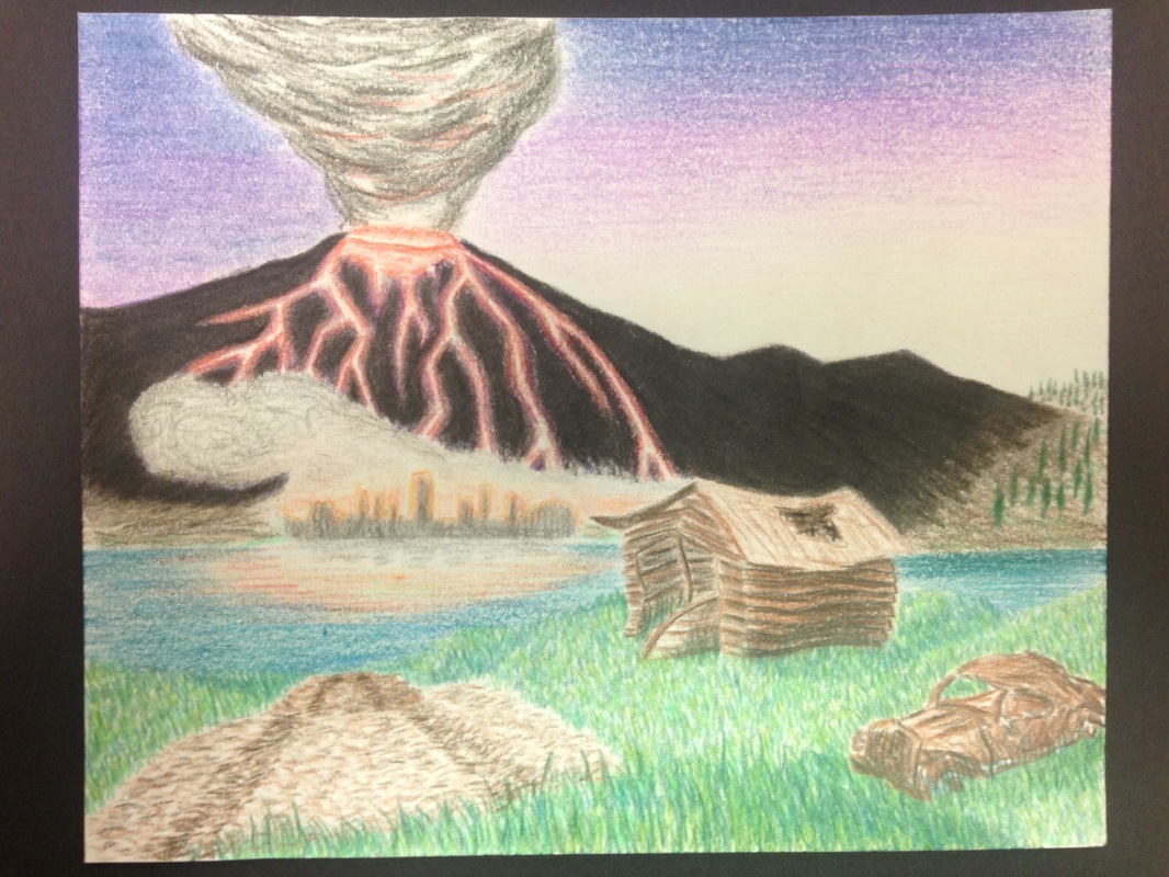 My first work in only colored pencil. I think this piece is good, but I think my colored pencil work is best with line work as well. It's hard to define your lines with colored pencil without ruining the integrity of the drawing. This principle is similar with prisma pencils as well. The point of them is to create realistic type of artwork without the use of lines.
I really enjoyed working with the grass, and I like the effect it has on the foreground. This definitely looks better than if I had just tried coloring the hills green. If I had to redo anything in this project I would fix the silhouette of the volcano in the background. After coloring for some time I thought it would be unique to have a dark silhouette of the volcano to contrast the sunset. That along with the veins of lava do not look very profound. This just goes to show that my skill in complete colored pencil is still at it's odds. I'm not giving up on this technique, I just need to stick with using lines and edges as a guide for now. This piece is cool but I think that my best work involves colored pencils and line-work. Watercolor plan #1--ocean blue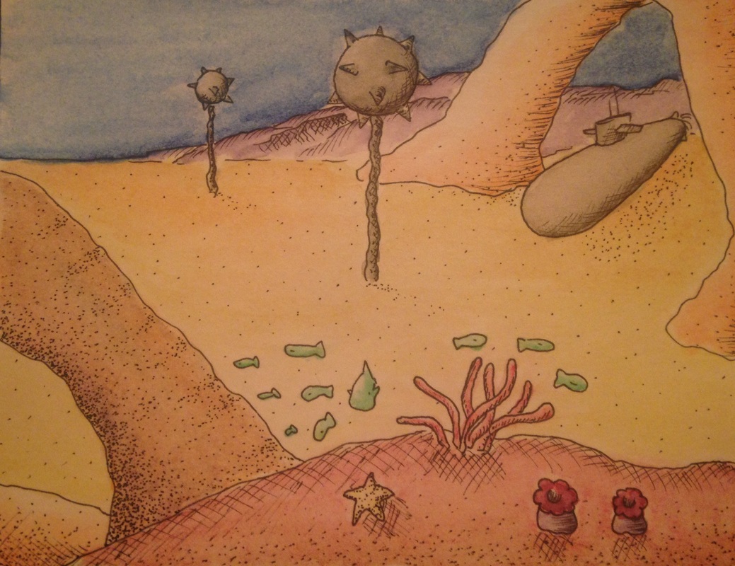 (Soon to be better quality image) Watercolor plan #2--sunset orange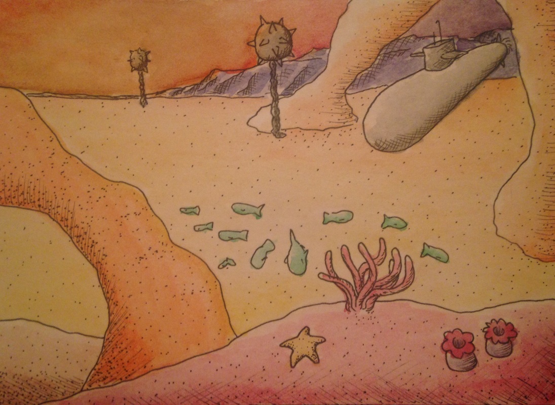 final piece: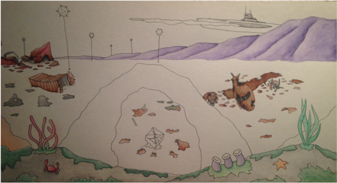 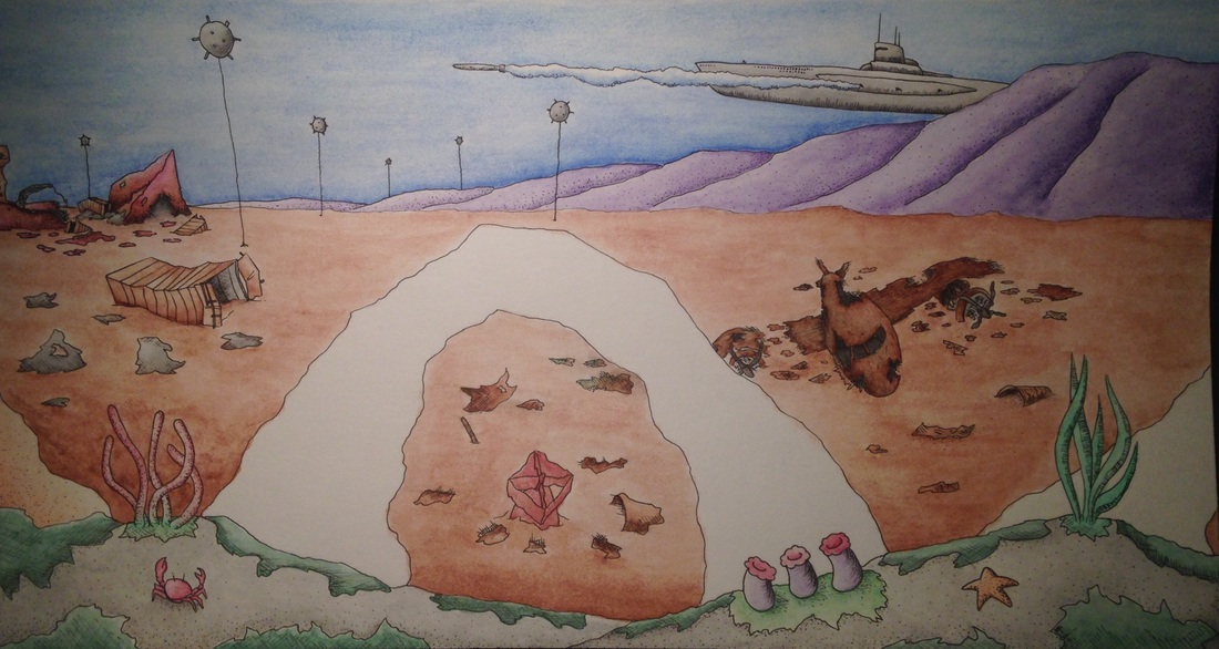 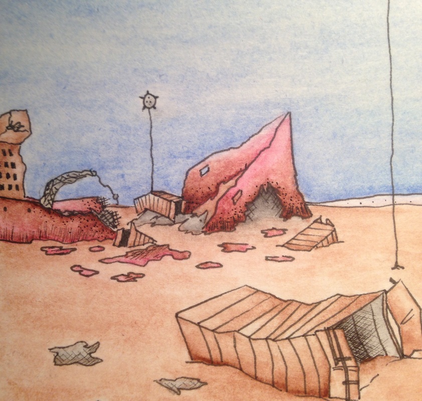 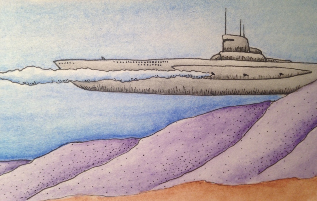 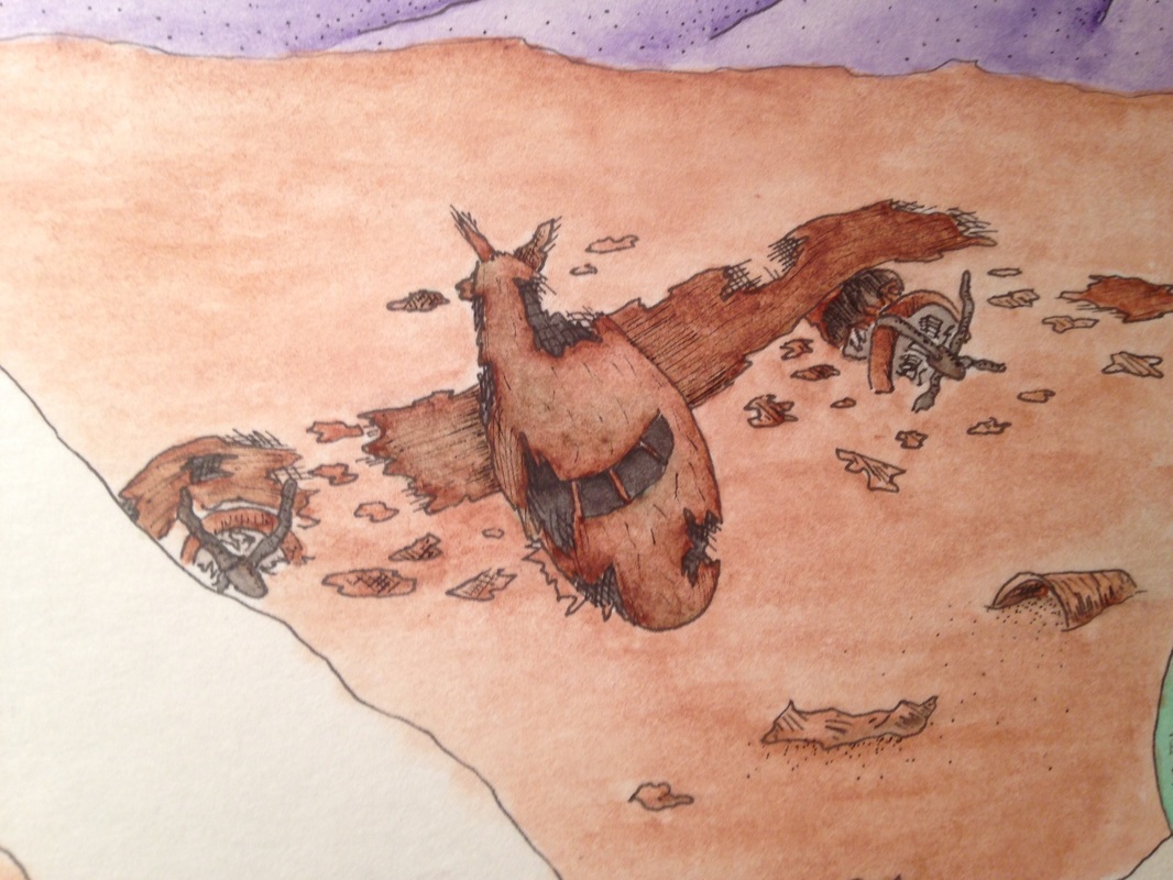 Here's an underwater scene I'm making using watercolor & ink. This picture is depicting another 'war' scenario created by man. The setting is a reef that has been riddled with sunken ships and shot-down aircraft. There is a submarine in back, behind the drop off, firing a torpedo. aside from the objects in the picture, the values were the most difficult to capture with the watercolors. Being able to get the right amount of water in certain areas can be very hard because if the paint is not applied carefully and in small amounts, there could me dark ink splotches all over the place.
I made the mistake of placing one of the arches in the middle of the picture. This takes away from the photo because it is dead center. That is not good in the eyes of the viewer, your subject matter needs to follow the photo placement rules in order to look attractive. There's nothing I could do now to fix this except crop the picture, but I don't want to cut away the ship in the back. This is just a lesson I'm going to have to learn in order for my future pieces to turn out better. As usual with my watercolor I started with ink, then added my colors, and after they're dry, I add variants of shading/stippling to darker areas to make them have better shadows. Looking over my 'bulls eye mistake' I think this piece turned out ok in the end. The problem with this type of work is it gets me too detail orientated in one section, and costs me too much of my time, with little to show for it. The amount of detail is so small that a half an hour's work can make it seem like I did nothing at all. 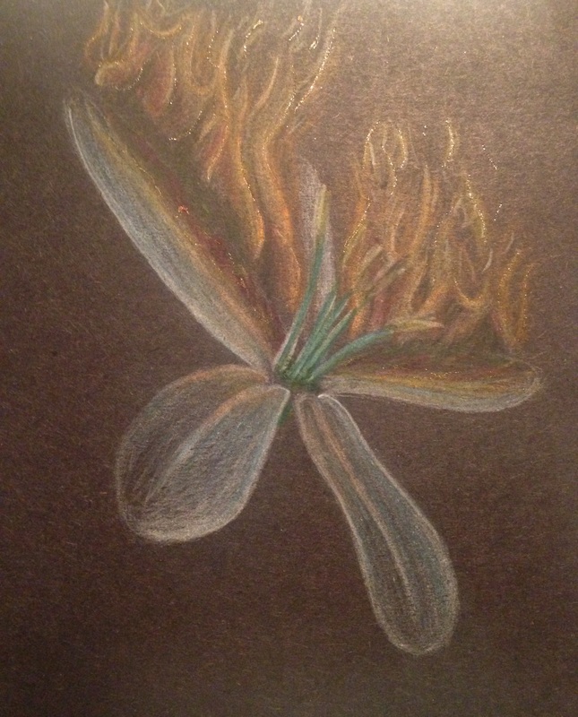 I am extremely disappointed with the turnout of this piece. I told myself I would m]never work with prisma colored pencils again, and now I remember why. Some think it was the paper, but I think it was my skill as well. I am not fond of prisma pencils due to their extreme properties. You have to blend lots of colors together to get the desired effect and I don't do that too much. I'm good with my fantasia colored pencils, but the texture of the prisma's are so weird. I wanted to give prisma another go, and maybe I just might give them another chance in the future, but I'm holding off on them to focus on styles I'm already familiar with. Another thing was that I was pressed for time and had to do this piece in a matter of just a few days. The quality is bad and in order to finish I had to dumb down my original concept. It's unacceptable to submit something like this to a college, therefore I am substituting for another piece. I will have to find the time to do so (probably over spring break) but I will create an even better piece to replace this one.
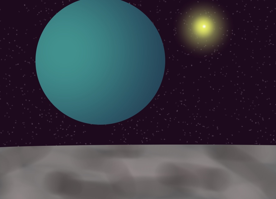  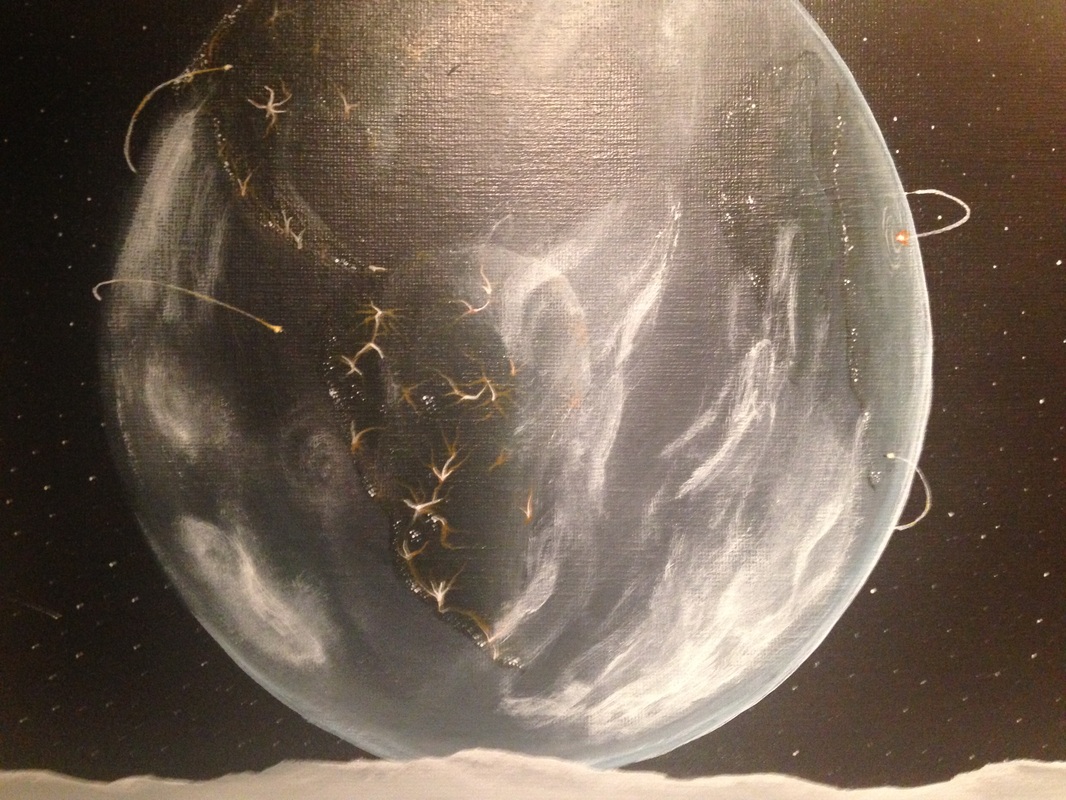
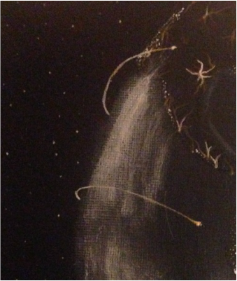
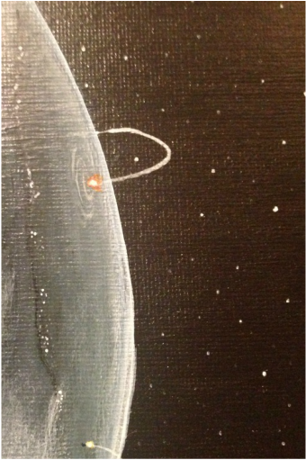
I still have to put the final picture of this up on my blog, but this is most of the progress I've made so far. This is another acrylic painting I'm working on that represents humanity's contribution to destruction. In the close-ups the viewer can see missiles on either side of the earth's horizons. The clouds surrounding the earth are dis-proportioned and mangled to that of normal clouds. This represents the "nuclear winter' man has created after years of war. The viewpoint has been set on the moon to give proportion. This was a better choice then to just be floating in space. In the foreground there is a shuttle that landed on the moon several years back, with a fractured space helmet in the close left corner. I put the objects here too balance the rest of the work. The different perspectives added to the moon's surface give depth to the overall picture.
I had lots of trouble with painting the sun and her glow because I layered the glow instead of blending it in with the deep purple (space). I think it's time I get out of my habits in acrylic and move onto something much more simple, but still presents a challenge. All this acrylic work is hard on my time as an artist and it sets me back from completing my other work. Acrylic is good, but it will definitely be better to experiment and progress my skills with other mediums. 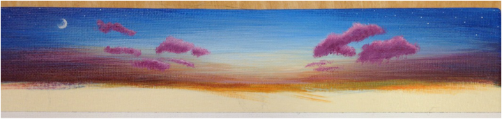 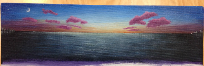 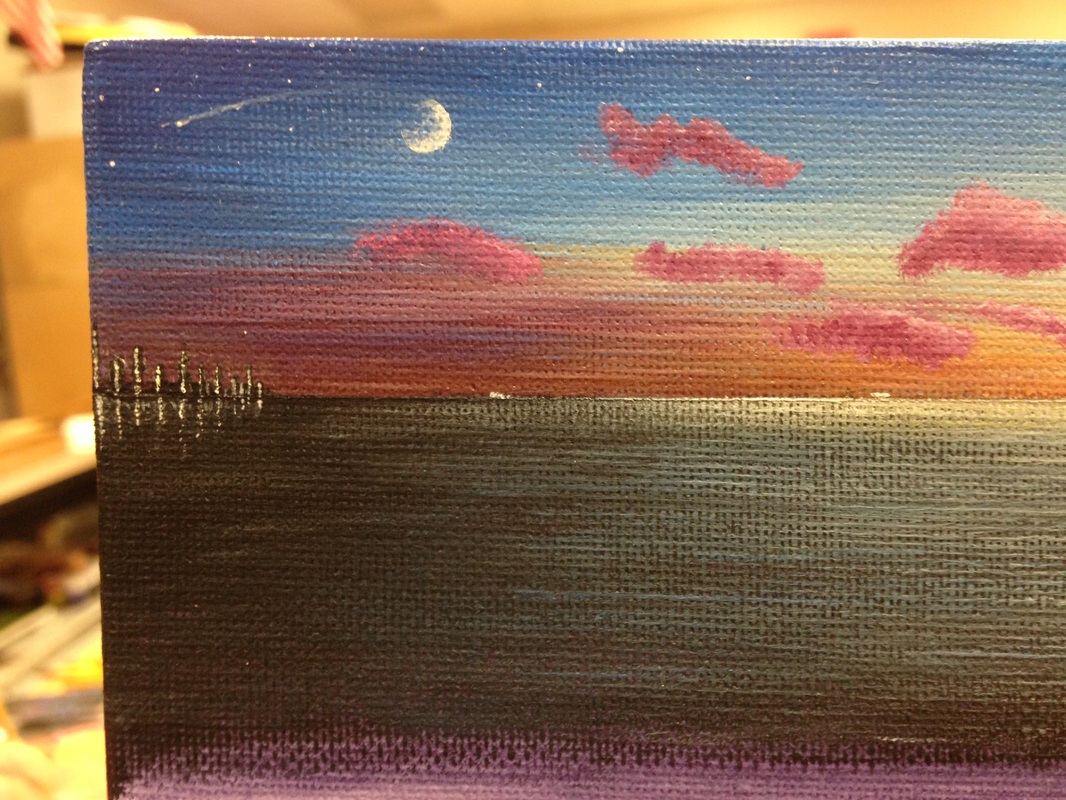 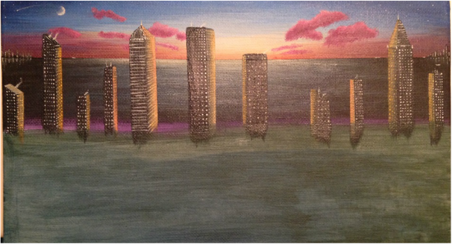 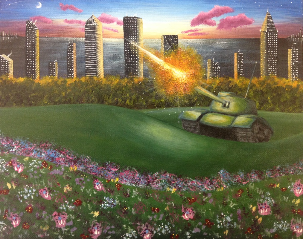 Here's another acrylic piece. My classmates really like my work in acrylic paint so I thought I'd try another painting. I really enjoy working with these types of paints, they give me the freedom to mix, layer, and fix mistakes. From this picture it is pretty easy to tell how I managed to layer everything together, but I am really enthralled by the balance in extreme and neutral colors. The only problem I ran into is a problem most detail orientated artists stumble across, time. I have two weeks to complete two different projects, and being the artist that I am I need that much time to complete one project. The only other way would be to work twice as hard and finish stuff at home too, other I would need to rush and the quality would suffer greatly. This was my first set of projects for the semester, so I didn't realize how fast time was approaching and I failed to create a quality piece for my second project. Although I am getting used to organizing my time now, I need to replace my second project with a better quality piece.
This painting is another part of my concentration and I think it is becoming a bit more clear as to my purpose. I tried to balance out the sky and the clouds with the flower bed in the foreground. I also took into account my placement of the landscape. Our class discussed where, and where not to put put things in photos in order to make them more appealing to the viewer. I used the rule of thirds method and placed my objects in certain areas. I am hoping to work with this media many more times in the near future, I just need to make them good, and fast. 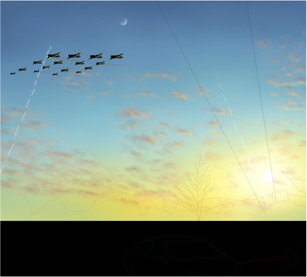 (More pictures coming soon)
Creating a concentration is hard, but once you get a grasp on what you want to happen, the reality comes to life. I have lit a spark that has branched many ideas across my imagination in ways that open new doors to my perspective of art. Most people might be confused as to what I am trying to achieve through my concentration. The purpose is to speak to the viewer and create a thought process about why we, as humans, fight. It could also represent the element of realizing what you have to lose after it's gone. What I'm trying to say is that it doesn't matter what my concentration is supposed to mean, what matters is that you found purpose in my art and thought about how this makes you feel. I finally put my artistic style to the test and tried working with digital media. I found that creating digital art is fun and simple, but difficult to master. From the photo the viewer can see a sunset and some planes. Those are actually bombers flying across the sky. I am creating this with my ipad and a stylus on an interesting application. I am trying to give the aspect of a painting through this picture. I used brushes and different strokes for the clouds, and then I create the aircraft separate from this piece, then import them later. The big part about the piece will be mastering the highlights created from the sun on everything else. You can already see I have highlights on the clouds and the planes. ----continue when finished---- 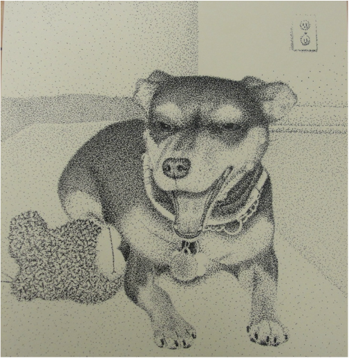 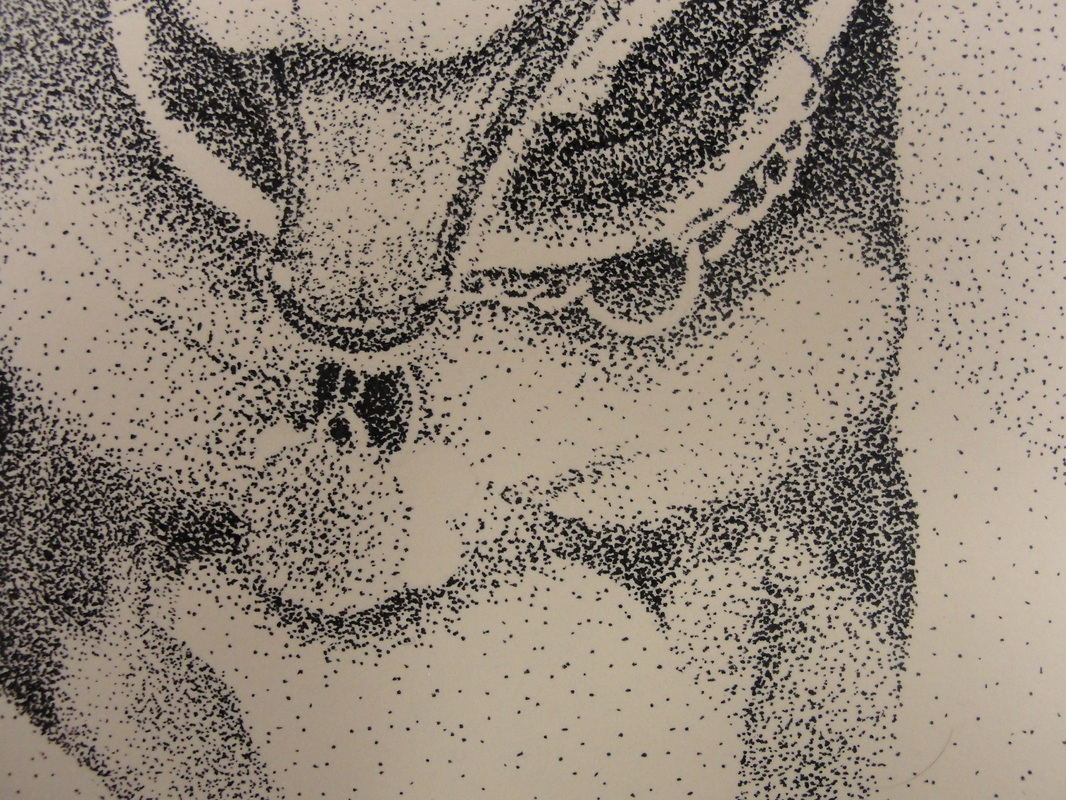 (More pictures to come <Progress>)
I am so happy to be working with stippling again after so long. This was my second piece I've done in stippling throughout my art career. Ironically my other stippling just so happen to be of the same pet. The only thing different this time around is that I used a much smaller tipped pen to complete this. There were many ups and downs to using this pen. I found that I could add extensive amounts of detail without having to worry about bleeding (the pen) and creating unwanted blotches of ink. The downside is because of how small the marks are, it takes more time to create the desired value. The close-up photo of this piece reveals some of the values that I am talking about that are just emphasized enough to see. What I found interesting was the fact that I had to leave some aspects of the metal collar alone or else face the inability to see it, blending in with the fur. I had to leave it white, but thankfully this still gives the illusion of a metal leash. I struggled very much trying to incorporate a background with this piece. I've found this quite common throughout some of my other pieces too. This can be very frustrating because a background creates a serenity that is supposed to balance out the rest of the picture. I also have to take into consideration of what items in the background would hurt or benefit the outcome. Should there be lots of darks? Or perhaps give it an interesting perspective? There is so much to think about when coming up for ideas about the background. I have even found this more complicated than coming up with the idea for the art piece in general. In the end I feel this piece could have used a better touch that I should think about more next time. 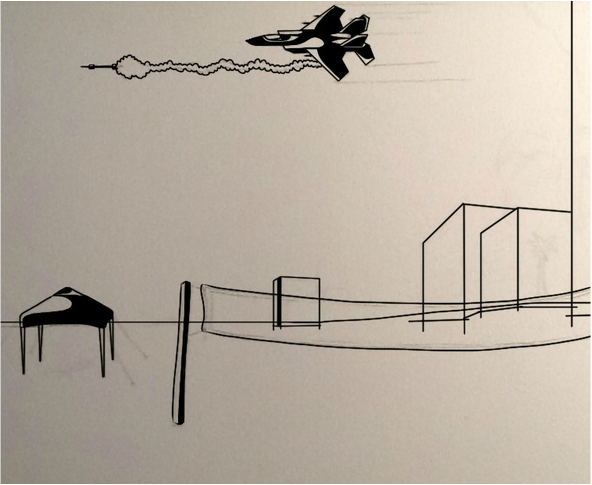 (More pictures coming soon)
I decided to have another go at creating a digital piece for my concentrations. I am still trying to get the hang of this because I don't have too much experience. I also decided to take a different approach with the creation of this piece of art. As you can see in the photo there is only black figures, with white highlights/cut-outs. I found this style through some experimentation and I think it is an interesting style to toy with. Although the finished product will lack realistic quality, there is still a nice "comic book" type thing going on. The setting for this piece is based off of a beach I visited over the summer. This will develop into a piece that has what seems like any ordinary day at the beach, but with a twist. There will be destruction across landscape, but the beach itself will look as if people were just there enjoying a nice hot day in the sun. ----continue when finished----  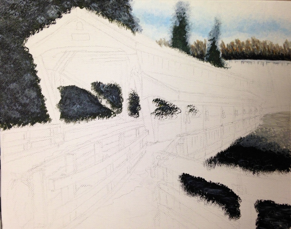 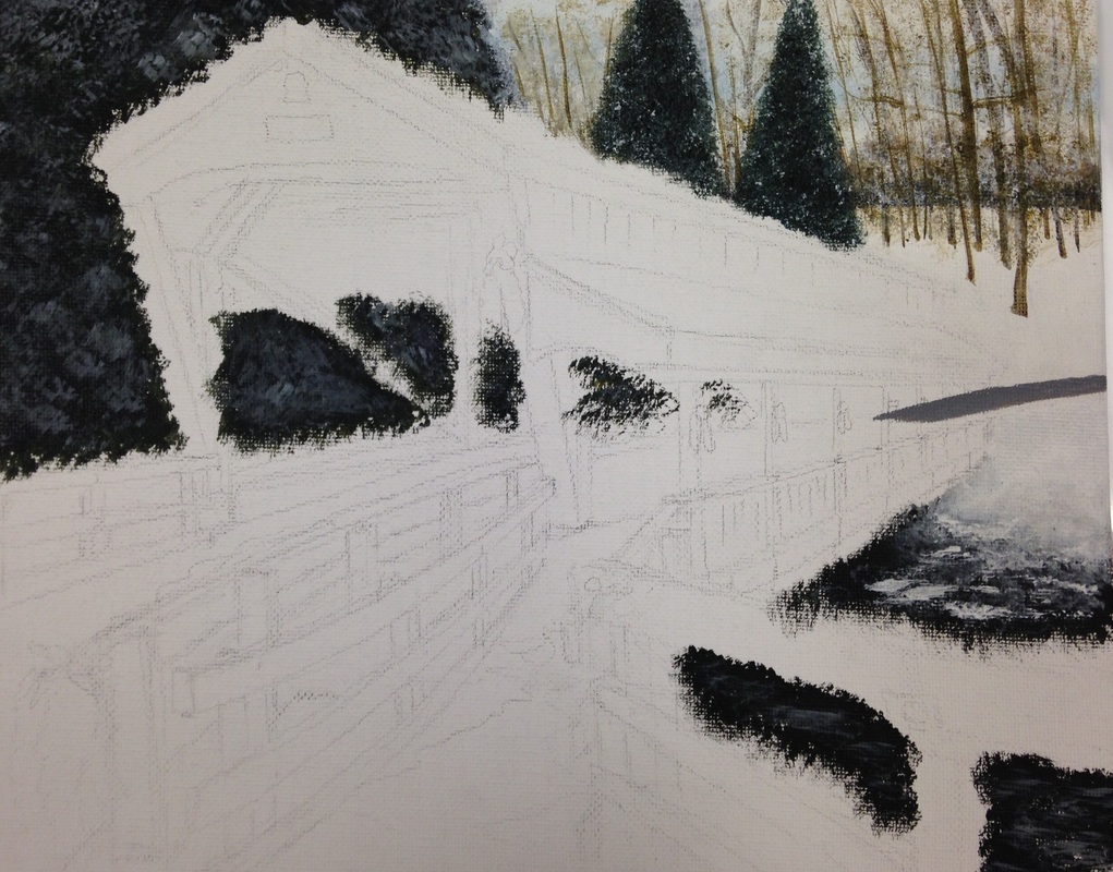 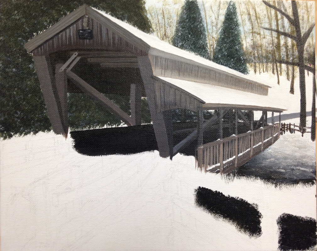 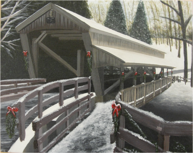 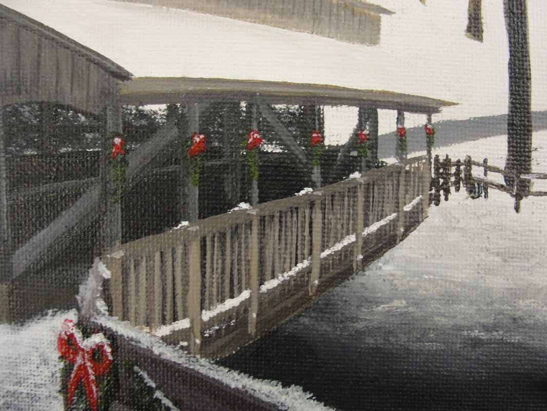 (More pictures to come <Progress>)
I very much enjoy working with acrylic paint. I haven't done a painting with acrylic in a good 3 years. I find this medium much easier to work with than oils because acrylic allows the user to layer (to fix mistakes) and it dries much faster. I was able to mixed wide varieties of colors to get the values you see in this piece. The biggest part about working with acrylic is the artist's skill in layering. Because of this feat, the user must create the background first, then layer on top the foreground. Without using this technique, (i.e.- painting the foreground first) the artist must paint around their foreground to make a background. This leaves margin for creating white spaces around the foreground, and the brush strokes will look bad. I had trouble keeping my color palette the same throughout the entirety of this project. In the reference picture I used, the colors were more vibrants and orange (in the browns). I didn't like that about the picture so I changed it up a little bit. I wanted this painting to feel like more of a fall-based piece. I felt this aspect would be achieved by darkening my values by adding a smudge of black to each of my darks, and add white to those same darks to create pale, lighter colors. I think this worked out well in my benefit, and the overall piece turned out good. To finish this piece off, I added wreaths with bright red bows to give direction and balance to my pale color palette. 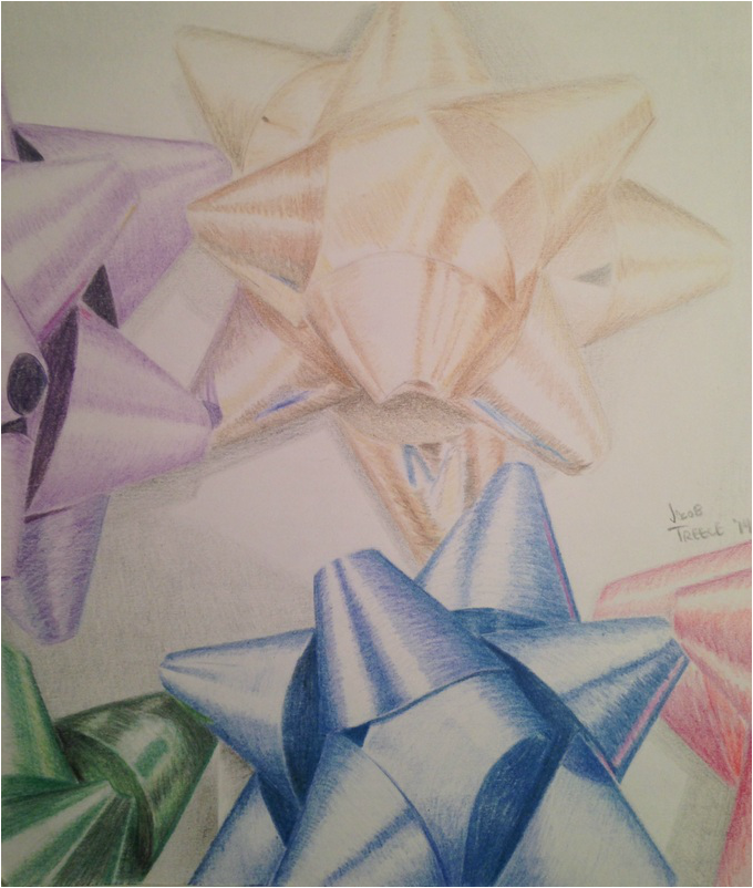 Experimenting again with my fantastic "Fantasia" colored pencils was another wonderful experience. Over the past few weeks I have struggled to perfect my skills in reflections, but I feel the final outcome turned out better than I thought. I cropped the original contest image to an enlarged status because I really wanted to extentuate the detail. I learned a whole lot of new skills through this project. Many of them dealing with reflected colors from nearby objects (seen in some of the golden bow). This really gives that effect of realism to a piece with shiny surfaces. I am definitely excited to do another piece of art with these colored pencils because I find them much easier to create the colors I like rather than Prisma-colors. I am also looking forward to see who the winner is of this contest, there are so many great pieces that my fellow classmates made that blew my mind.
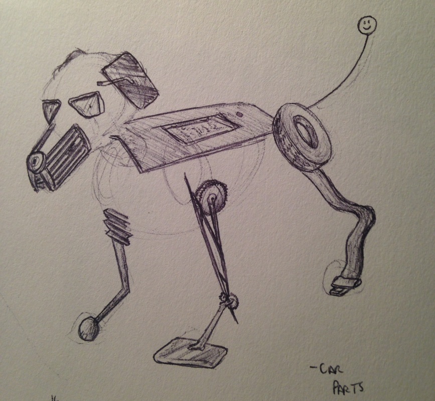 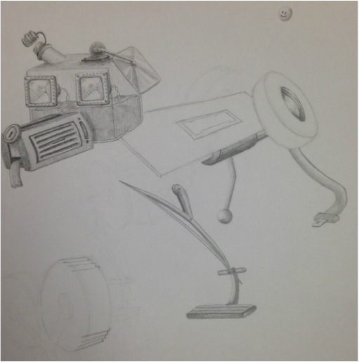 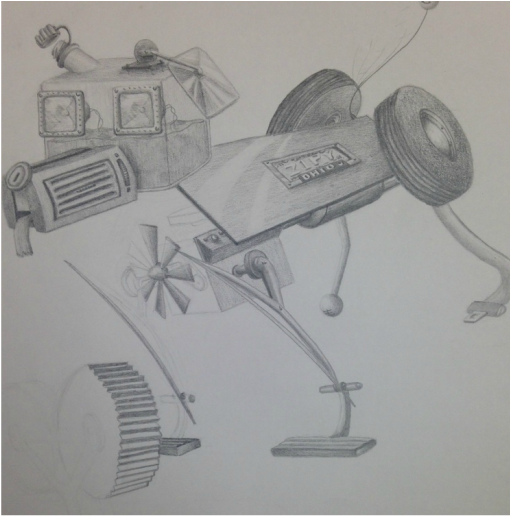 Finally, one of my favorite and most skilled mediums, pencil. This project's base was to use a drawing medium and I felt that using pencil would be my best option. Although my eye for detail is very decisive, it is also time-consuming. The subject matter had to be mechanical and I chose to turn a dog into a bunch of car parts that fit in an appropriate manner. I have had a lot of experience with pencils because it is the base medium for almost all traditional style art pieces. I've also had trained experience in "Drawing" class as well. I know how to make different shades blend with one pencil, but it is nice to have a variety of pencils too. I used HB for most of this piece, and 2B, 4B for the darker areas. I love working in pencil because the margin for error is little due to it's erasable properties. I also use a kneaded eraser to touch up some of the hard edges and create distinctive reflections of light on many of the metal objects. I can't wait to finish this project and see how this turned out. I took a different approach on mechanical ideals this time because most of the machines I saw online were robot based and not just hunks of metal clunked together. ----continue when finished----
   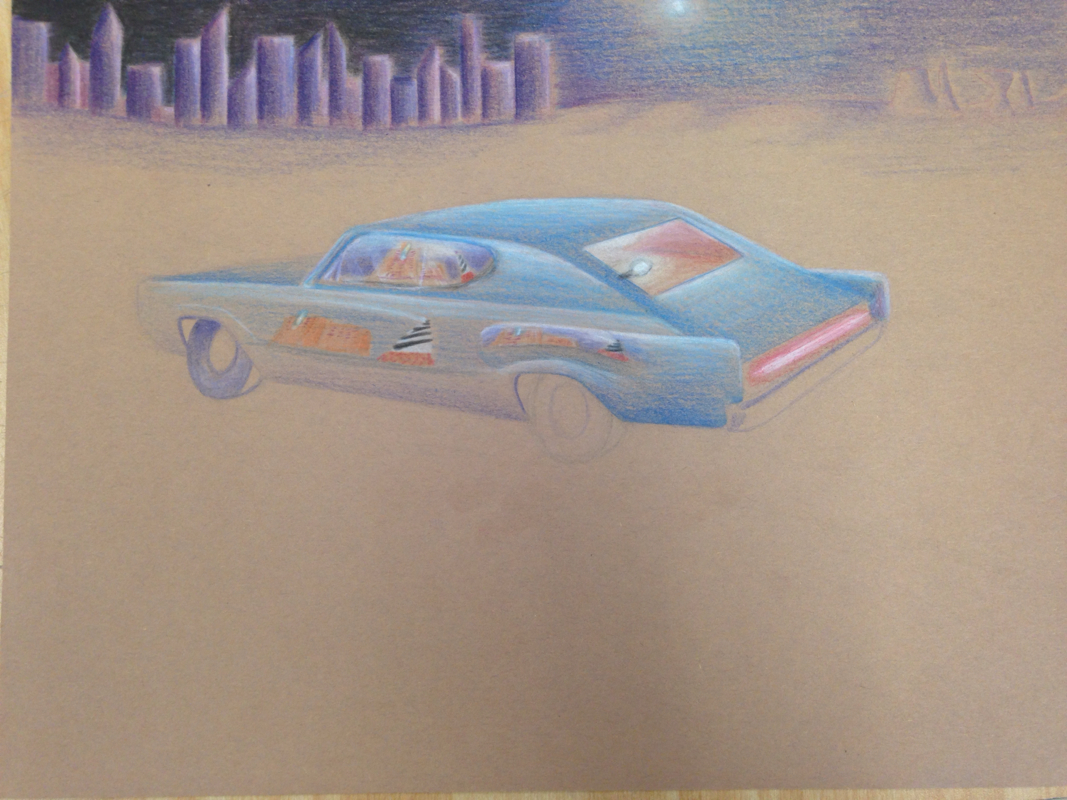 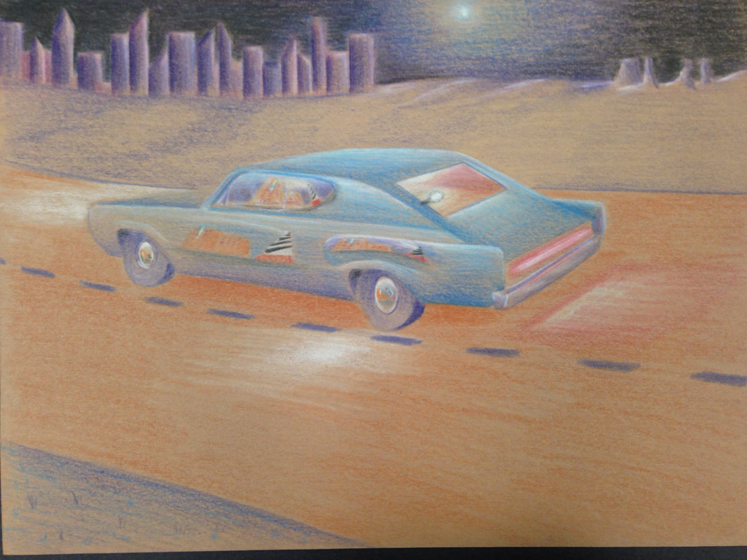 This was my first project in Art 4, and I feel it went pretty good. I've worked with prisma-colors before, but this is my second piece. This project required having reflection(s) in the work that also describe the artist in some way. Not only that but we were supposed to pick a unique color pallet as well. I picked dark colors such as navy blue, violet, and pale red, but to make the reflections stand out, I used brighter colors to call the viewers attention.
As a child, I loved to mess around with "Hot Wheels," so I brought some in and found that I could use some of the reflections on it. This element in the piece describes my childhood. Another element I included was having the setting be night time. I love the night, especially when driving, it is very cool to see the moon light up the night and city lights reflecting the stars. Since cars are known to have distortive reflecting properties I thought this would present an interesting challenge for me. Those two things you see throughout the car are my two favorite vacation spots. One is the Cape Hatteras Lighthouse (OBX) and the other is a resort we visit every year in South Carolina (Myrtle Beach). I thought it would be cool to reflect them off different panels of the car like it was driving by them on the road. Overall I think this piece turned out pretty good, but it would still help to use this medium again in the future. 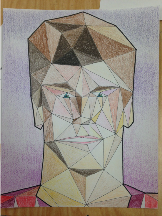 This subject matter for this project was portraiture. I chose to challenge myself by mixing up some of the concepts. In the picture, the viewer can clearly see triangles, which is the only shape used to make up the portrait. Through my reference picture I determined where to place the colors accordingly to make this look like me. This is very much like "pixel art" because up close, there isn't much of an image, but further back the colors arrange into an image. This concept was the hardest I could think of, due to the nature of how difficult getting the triangles in the right spot was. After all the line-work, it was just a matter of getting all the colors in the right spot. I also used a sharpie marker to make a thick line around the picture to make the image popm more. I really don't like working with portraits because the margin for error is too high. There are too many things to consider when working on certain sections of a face. I've done a few portraits before, and were decent enough to look like me, but I still find this as one of my least favorite subjects.
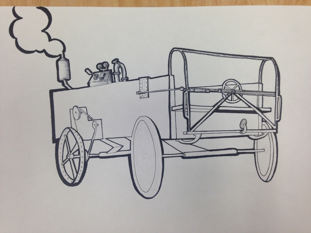 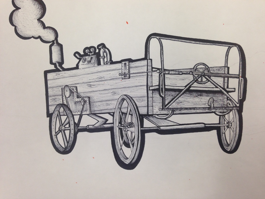 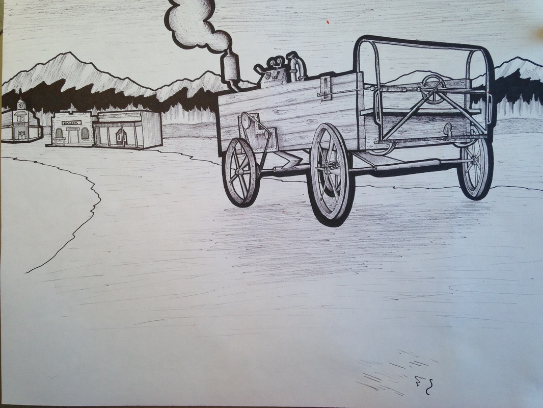 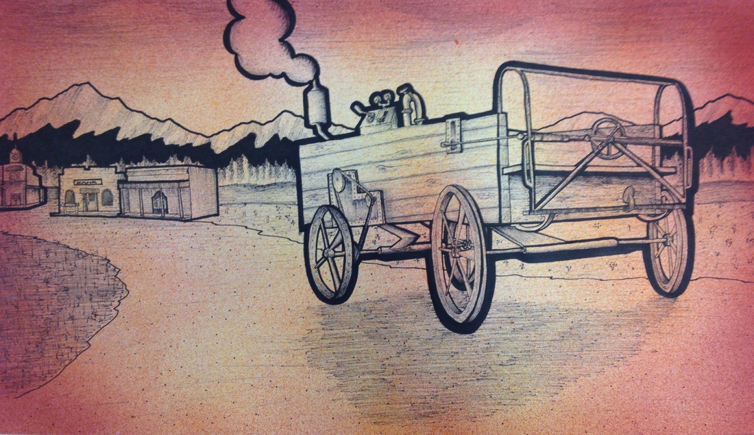 This project represents a sort of "Juxtaposition" style art. This picture is supposed to be an old western type of media. I used fine tip markers as my media, and line as my technique. I really like using specific line work in my art pieces because it gives me more freedom to demonstrate what I am representing. My line work defines what I draw to give the drawing purpose in the eyes of the viewer. The idea of "Steampunk" might come to mind when one looks about this image. The wagon would not normally have an engine on it because of its time period. I researched some of the machinery used back in this time period (1890's) and found that the way I made the wagon looked uniform to that of other forms of technology. My experience throughout this piece was amazing. There is a grainy style filter on the final piece. This effect I created by using an airbrush after I finished all the ink-work. The only reason I used this effect was because one of my classmates splattered some orange paint on it by accident. This sparked the idea of making this image look as if it belonged on the side of a saloon as some sort of poster. The purpose for the lines in this project was for me to experiment with different weights and textures to make a photo realistic type of cartoon.
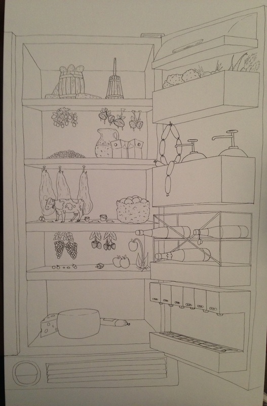 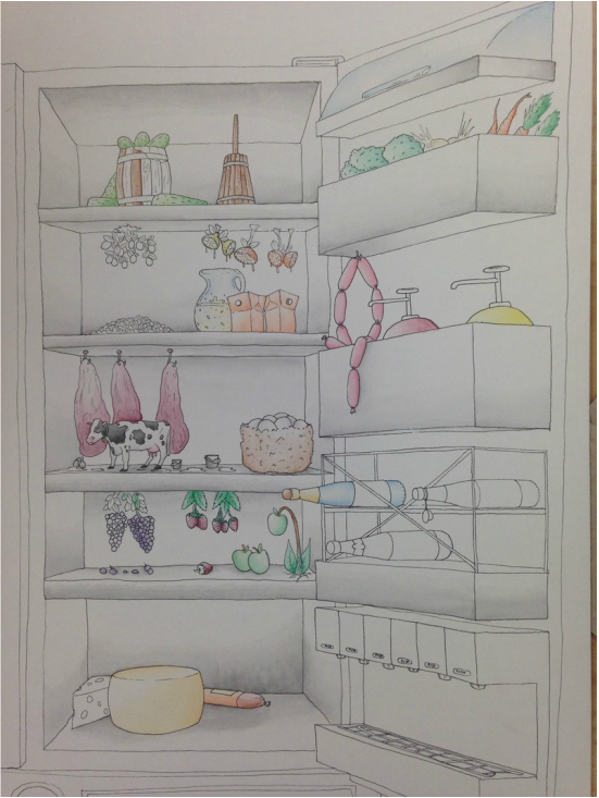 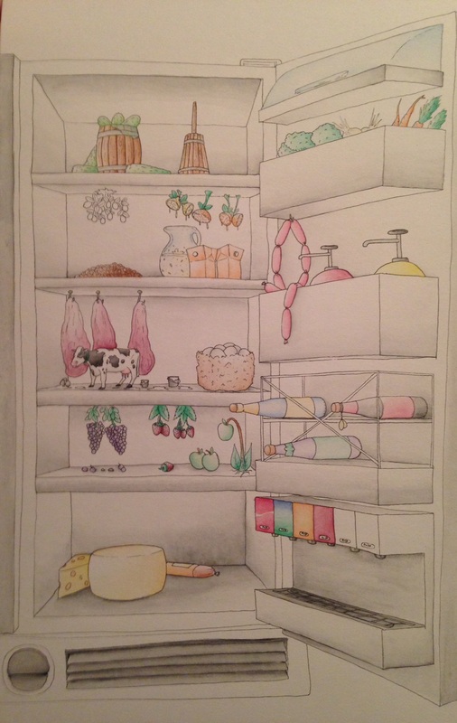 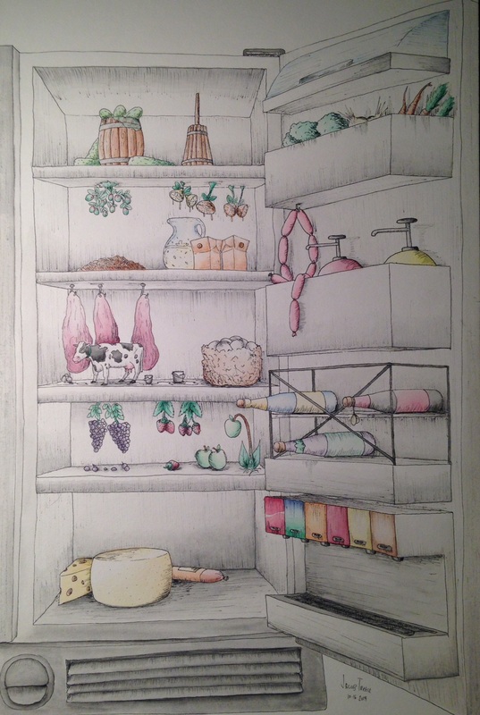 Working with watercolor is a great medium. This is my second time using this as a medium, but I think I am getting really good at this. I've learned that the water must be put on the paper first and then use little bits of color to create gradients. This idea of interior space as a project catches my interest in different ways to express my new theories of concentration. My idea for my concentrations is going to be revolving around "Representationalism." The way this will work as if I am redoing and image or idea as if it were something else. The cow in my picture is a good example. This cow represents "Milk" in the fridge. The viewer might also see other things in this picture that do not belong as well. The point to get across from this idea is to convey the similarities between different types of media. I am looking forward to working in this media again. I am already getting better and better at watercolor, even though I have only just been introduced to the correct methods of using it.
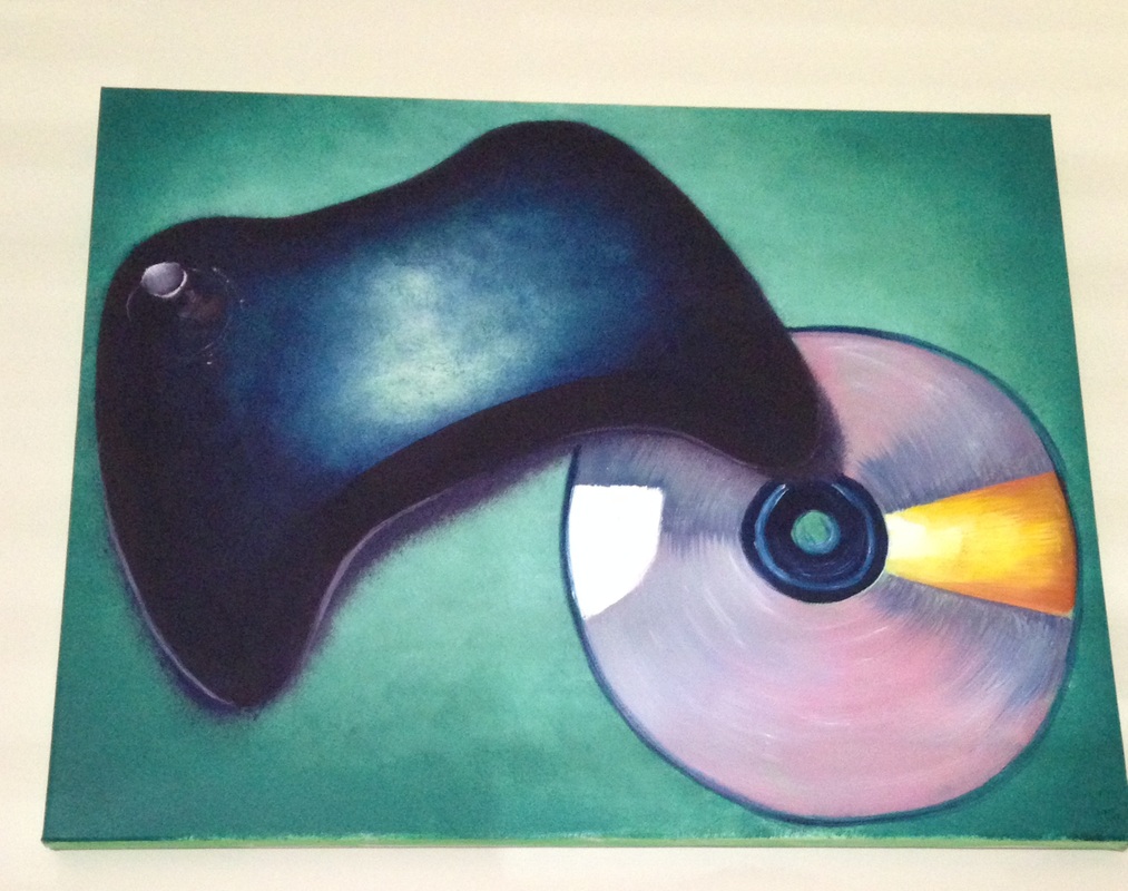 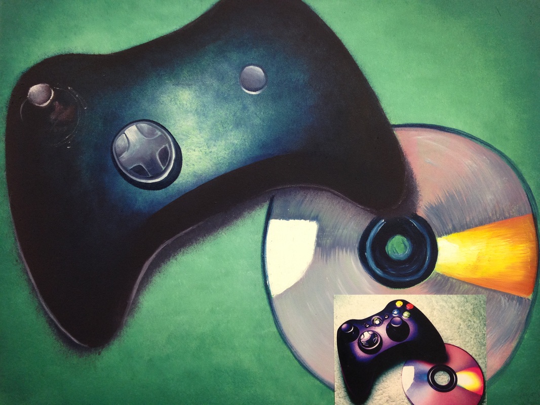 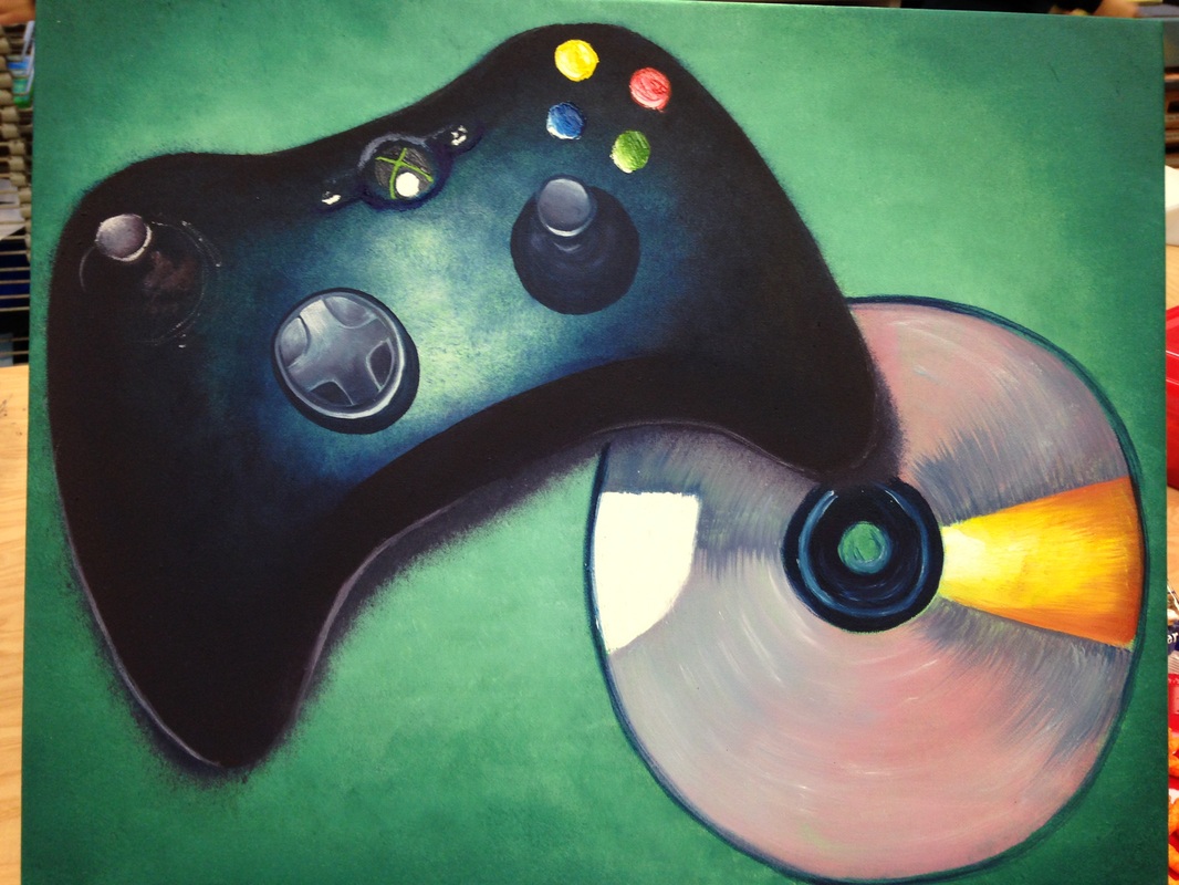 This project sparked my first freestyle oil painting. All the other oil paintings I've ever done were of landscapes, and with the guidance of a teacher-led class. When gathering the references for this painting I noticed that there were lots of dark and light values that I could try to manipulate. There were also many black areas in the pictures, so I took them into Photoshop and changed the colors in the picture to turn black into blues and purples. The HARDEST thing about this project was to paint an ellipse correctly. I will correct this soon, but the CD in the picture had a weird ellipse to it. I am normally very good at capturing the perspective of things, but I really need to work on ellipses. This was a very challenging painting to get the values right because oils take so long to dry, therefore the bright colors and highlights have to be painted first or else the darks will blend them and mess up the entire painting. I found it very interesting that oils give me the freedom of manipulation throughout working with shadows and blending. All the smaller areas I used a pallet knife because they were too small for paintings with a brush. The overall turnout of this was good, but I still need to fix the CD, which I made an ellipsed stencil to put on when I'm ready.
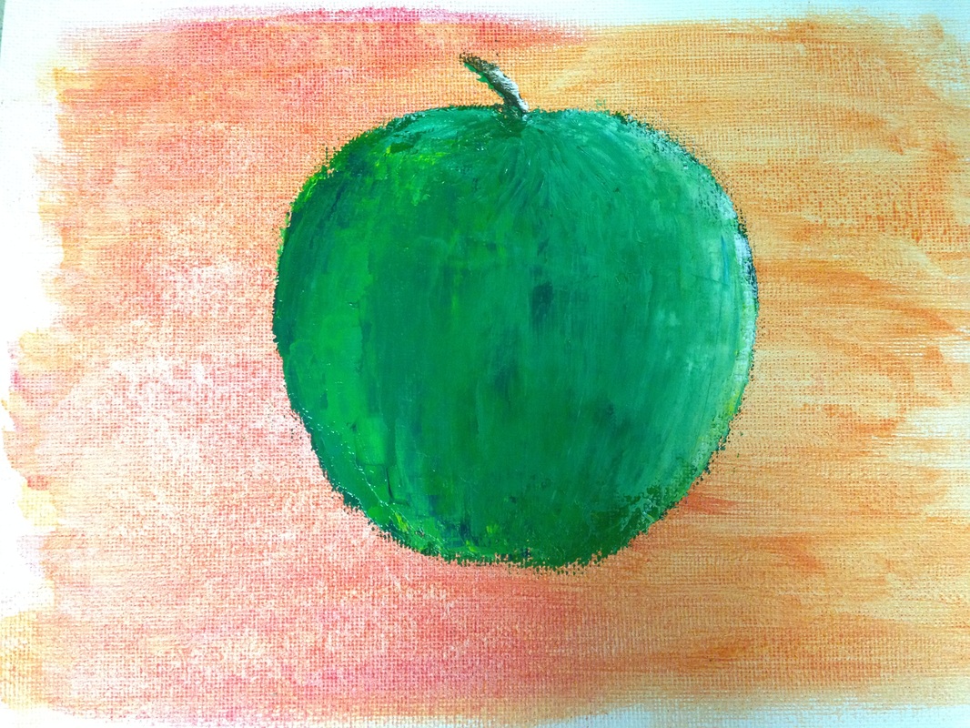 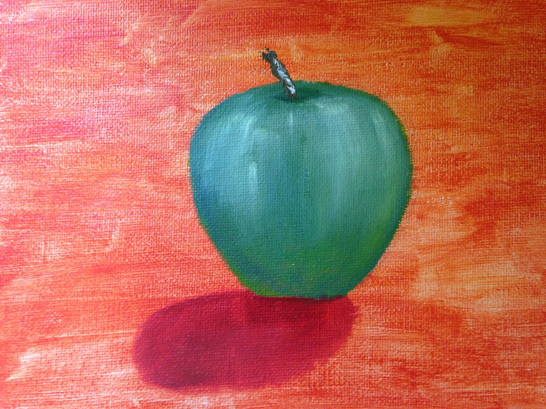 This was my first time freely painting with oils. Even though I've used them to paint landscapes, I was in a class. Now I'm on my own, and it presents a little challenge. These apples were pretty easy compared to what I will be doing. This is just practice for my oil project. Here there are two types of apples, a painted apple, and a pallet knife apple. Another important aspect to oil painting these was the wash. The pallet knife was the hardest, trying to create values that could only be blended on the canvas with only this tool. Although these were somewhat difficult, I think I got the hang of basic oil principles now.
|
AuthorWrite something about yourself. No need to be fancy, just an overview. Archives
June 2015
Categories |
 RSS Feed
