Watercolor plan #1--ocean blue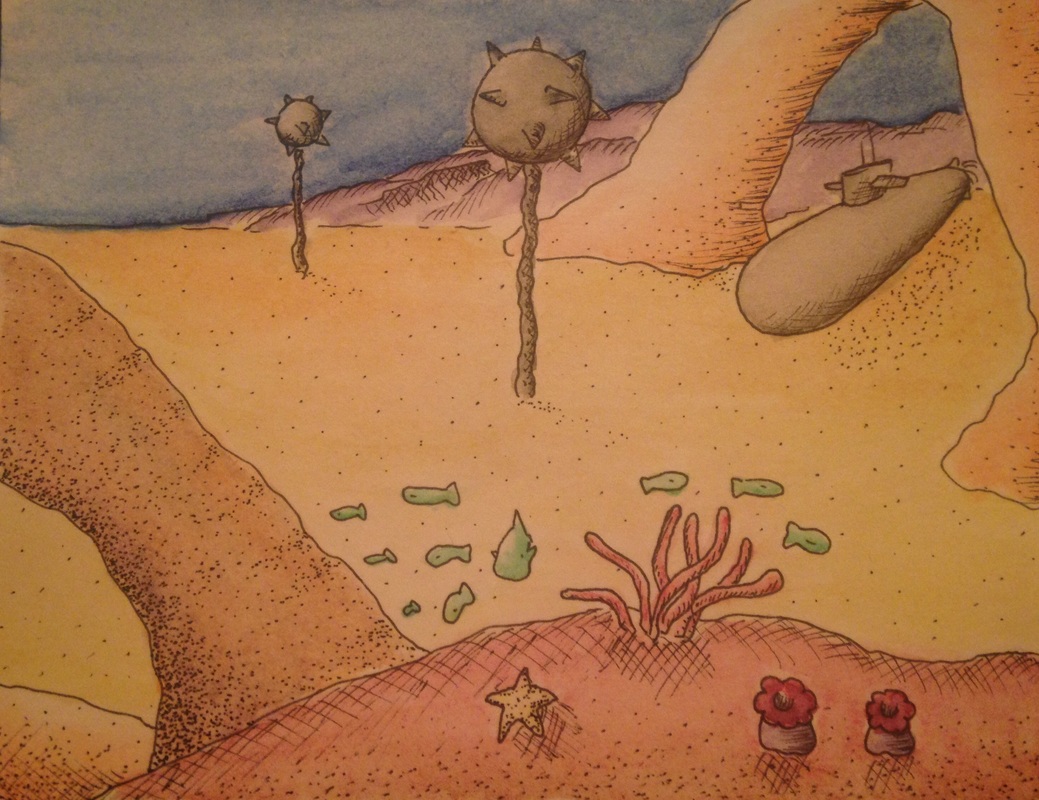 (Soon to be better quality image) Watercolor plan #2--sunset orange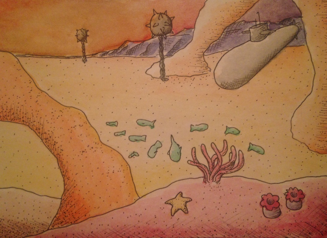 final piece: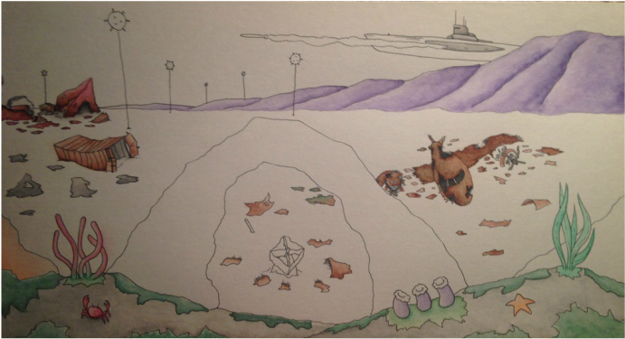 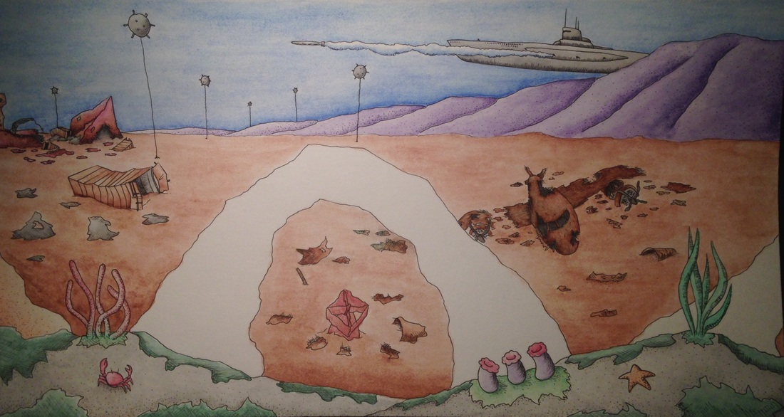 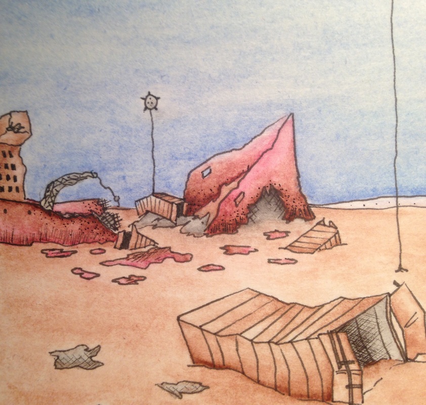 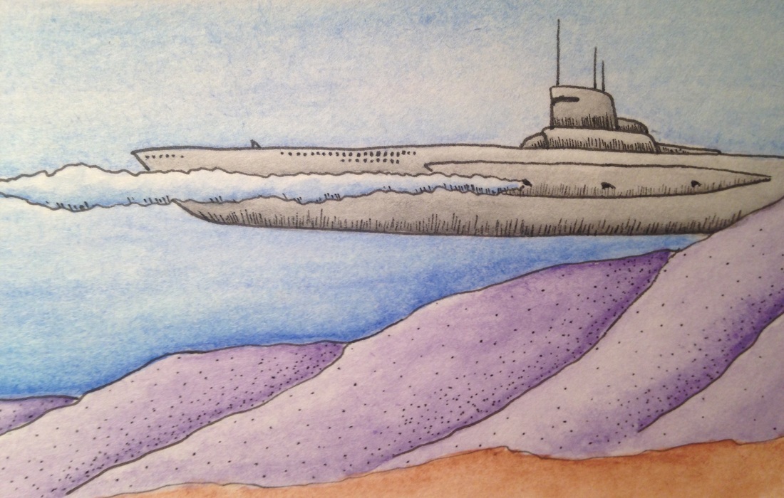 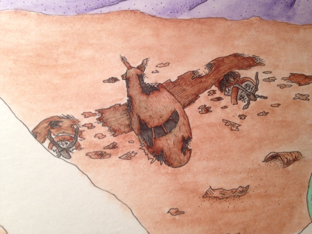 Here's an underwater scene I'm making using watercolor & ink. This picture is depicting another 'war' scenario created by man. The setting is a reef that has been riddled with sunken ships and shot-down aircraft. There is a submarine in back, behind the drop off, firing a torpedo. aside from the objects in the picture, the values were the most difficult to capture with the watercolors. Being able to get the right amount of water in certain areas can be very hard because if the paint is not applied carefully and in small amounts, there could me dark ink splotches all over the place.
I made the mistake of placing one of the arches in the middle of the picture. This takes away from the photo because it is dead center. That is not good in the eyes of the viewer, your subject matter needs to follow the photo placement rules in order to look attractive. There's nothing I could do now to fix this except crop the picture, but I don't want to cut away the ship in the back. This is just a lesson I'm going to have to learn in order for my future pieces to turn out better. As usual with my watercolor I started with ink, then added my colors, and after they're dry, I add variants of shading/stippling to darker areas to make them have better shadows. Looking over my 'bulls eye mistake' I think this piece turned out ok in the end. The problem with this type of work is it gets me too detail orientated in one section, and costs me too much of my time, with little to show for it. The amount of detail is so small that a half an hour's work can make it seem like I did nothing at all.
0 Comments
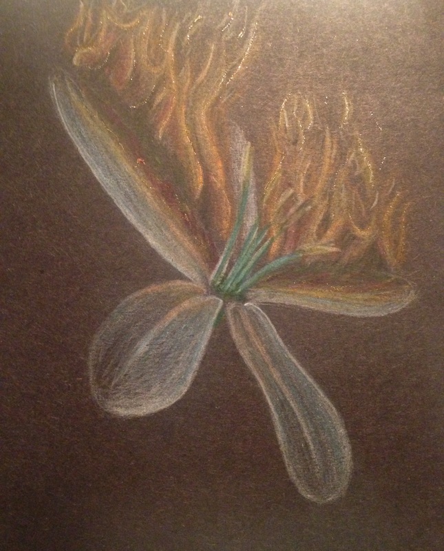 I am extremely disappointed with the turnout of this piece. I told myself I would m]never work with prisma colored pencils again, and now I remember why. Some think it was the paper, but I think it was my skill as well. I am not fond of prisma pencils due to their extreme properties. You have to blend lots of colors together to get the desired effect and I don't do that too much. I'm good with my fantasia colored pencils, but the texture of the prisma's are so weird. I wanted to give prisma another go, and maybe I just might give them another chance in the future, but I'm holding off on them to focus on styles I'm already familiar with. Another thing was that I was pressed for time and had to do this piece in a matter of just a few days. The quality is bad and in order to finish I had to dumb down my original concept. It's unacceptable to submit something like this to a college, therefore I am substituting for another piece. I will have to find the time to do so (probably over spring break) but I will create an even better piece to replace this one.
 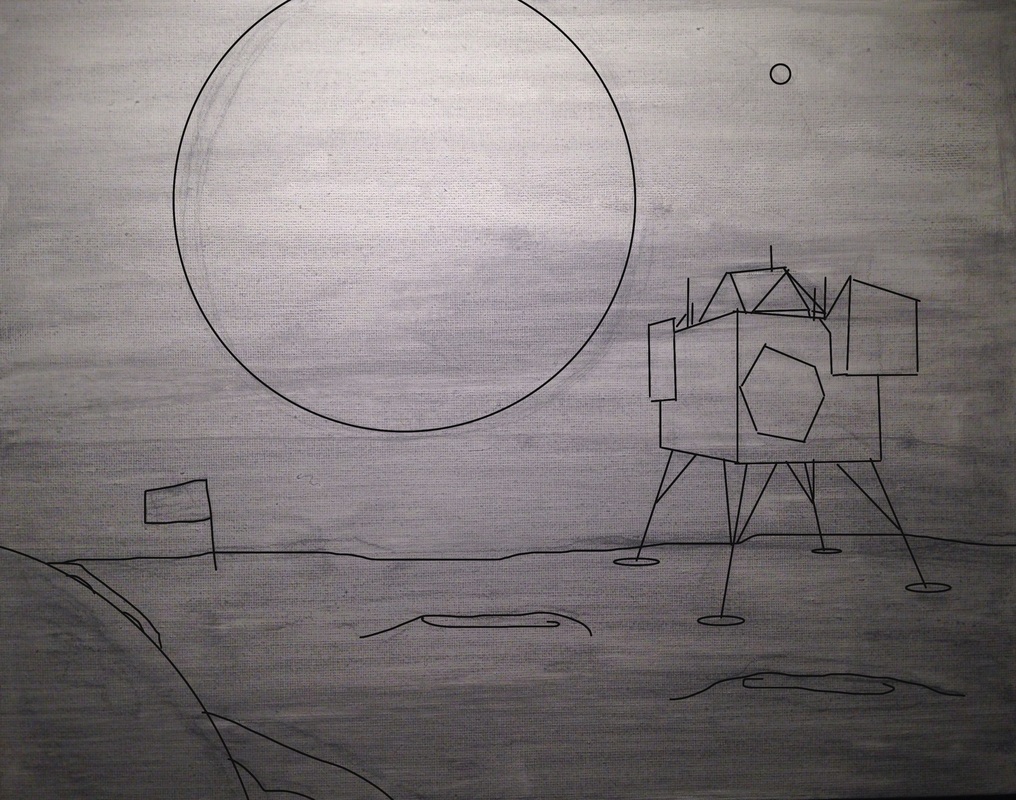 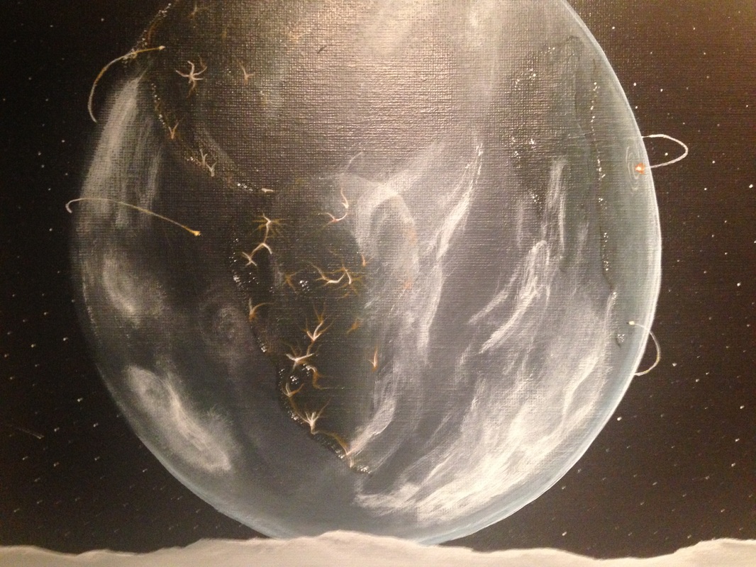
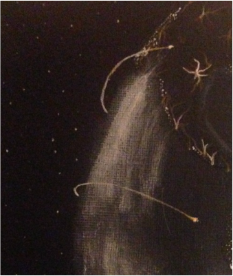
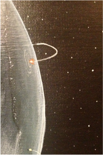
I still have to put the final picture of this up on my blog, but this is most of the progress I've made so far. This is another acrylic painting I'm working on that represents humanity's contribution to destruction. In the close-ups the viewer can see missiles on either side of the earth's horizons. The clouds surrounding the earth are dis-proportioned and mangled to that of normal clouds. This represents the "nuclear winter' man has created after years of war. The viewpoint has been set on the moon to give proportion. This was a better choice then to just be floating in space. In the foreground there is a shuttle that landed on the moon several years back, with a fractured space helmet in the close left corner. I put the objects here too balance the rest of the work. The different perspectives added to the moon's surface give depth to the overall picture.
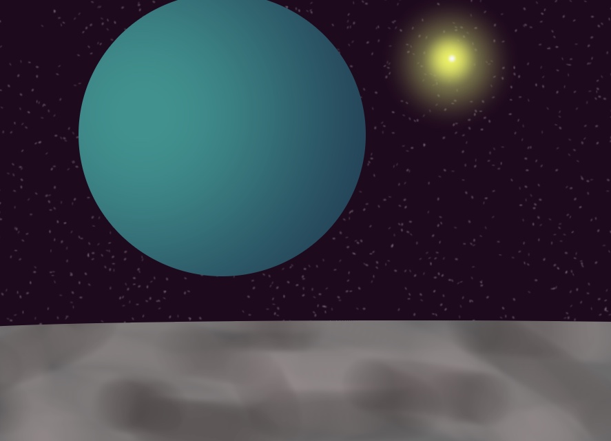
I had lots of trouble with painting the sun and her glow because I layered the glow instead of blending it in with the deep purple (space). I think it's time I get out of my habits in acrylic and move onto something much more simple, but still presents a challenge. All this acrylic work is hard on my time as an artist and it sets me back from completing my other work. Acrylic is good, but it will definitely be better to experiment and progress my skills with other mediums.     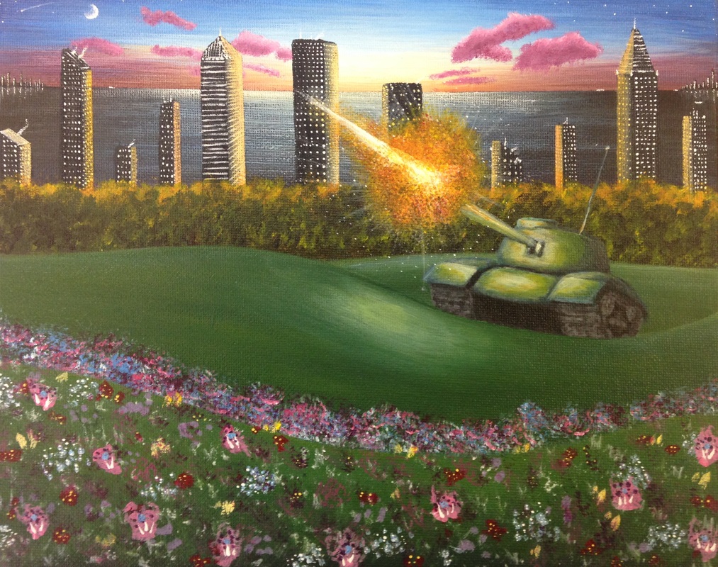 Here's another acrylic piece. My classmates really like my work in acrylic paint so I thought I'd try another painting. I really enjoy working with these types of paints, they give me the freedom to mix, layer, and fix mistakes. From this picture it is pretty easy to tell how I managed to layer everything together, but I am really enthralled by the balance in extreme and neutral colors. The only problem I ran into is a problem most detail orientated artists stumble across, time. I have two weeks to complete two different projects, and being the artist that I am I need that much time to complete one project. The only other way would be to work twice as hard and finish stuff at home too, other I would need to rush and the quality would suffer greatly. This was my first set of projects for the semester, so I didn't realize how fast time was approaching and I failed to create a quality piece for my second project. Although I am getting used to organizing my time now, I need to replace my second project with a better quality piece.
This painting is another part of my concentration and I think it is becoming a bit more clear as to my purpose. I tried to balance out the sky and the clouds with the flower bed in the foreground. I also took into account my placement of the landscape. Our class discussed where, and where not to put put things in photos in order to make them more appealing to the viewer. I used the rule of thirds method and placed my objects in certain areas. I am hoping to work with this media many more times in the near future, I just need to make them good, and fast. |
AuthorWrite something about yourself. No need to be fancy, just an overview. Archives
June 2015
Categories |
 RSS Feed
