 (More pictures coming soon)
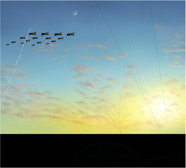
Creating a concentration is hard, but once you get a grasp on what you want to happen, the reality comes to life. I have lit a spark that has branched many ideas across my imagination in ways that open new doors to my perspective of art. Most people might be confused as to what I am trying to achieve through my concentration. The purpose is to speak to the viewer and create a thought process about why we, as humans, fight. It could also represent the element of realizing what you have to lose after it's gone. What I'm trying to say is that it doesn't matter what my concentration is supposed to mean, what matters is that you found purpose in my art and thought about how this makes you feel. I finally put my artistic style to the test and tried working with digital media. I found that creating digital art is fun and simple, but difficult to master. From the photo the viewer can see a sunset and some planes. Those are actually bombers flying across the sky. I am creating this with my ipad and a stylus on an interesting application. I am trying to give the aspect of a painting through this picture. I used brushes and different strokes for the clouds, and then I create the aircraft separate from this piece, then import them later. The big part about the piece will be mastering the highlights created from the sun on everything else. You can already see I have highlights on the clouds and the planes. ----continue when finished----
0 Comments
  (More pictures to come <Progress>)
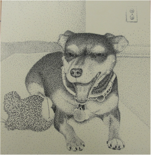
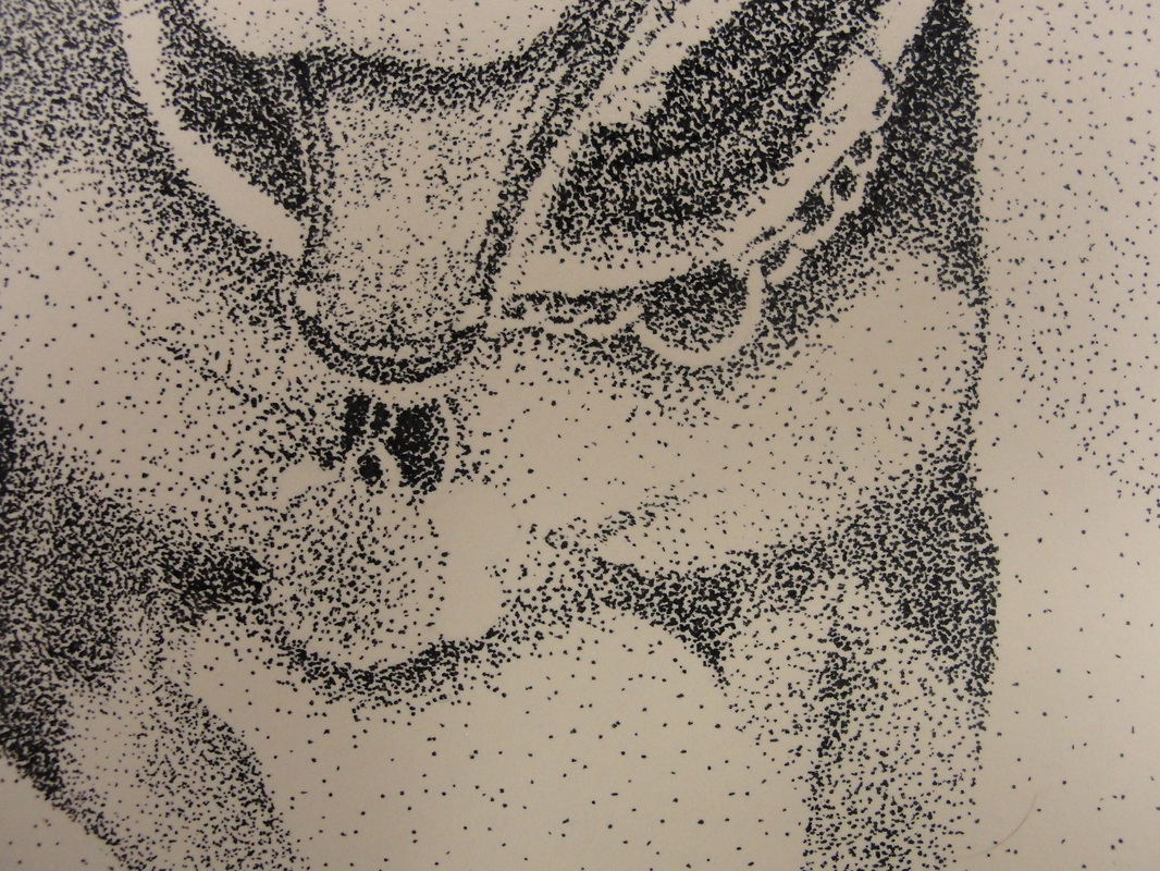
I am so happy to be working with stippling again after so long. This was my second piece I've done in stippling throughout my art career. Ironically my other stippling just so happen to be of the same pet. The only thing different this time around is that I used a much smaller tipped pen to complete this. There were many ups and downs to using this pen. I found that I could add extensive amounts of detail without having to worry about bleeding (the pen) and creating unwanted blotches of ink. The downside is because of how small the marks are, it takes more time to create the desired value. The close-up photo of this piece reveals some of the values that I am talking about that are just emphasized enough to see. What I found interesting was the fact that I had to leave some aspects of the metal collar alone or else face the inability to see it, blending in with the fur. I had to leave it white, but thankfully this still gives the illusion of a metal leash. I struggled very much trying to incorporate a background with this piece. I've found this quite common throughout some of my other pieces too. This can be very frustrating because a background creates a serenity that is supposed to balance out the rest of the picture. I also have to take into consideration of what items in the background would hurt or benefit the outcome. Should there be lots of darks? Or perhaps give it an interesting perspective? There is so much to think about when coming up for ideas about the background. I have even found this more complicated than coming up with the idea for the art piece in general. In the end I feel this piece could have used a better touch that I should think about more next time.  (More pictures coming soon)
I decided to have another go at creating a digital piece for my concentrations. I am still trying to get the hang of this because I don't have too much experience. I also decided to take a different approach with the creation of this piece of art. As you can see in the photo there is only black figures, with white highlights/cut-outs. I found this style through some experimentation and I think it is an interesting style to toy with. Although the finished product will lack realistic quality, there is still a nice "comic book" type thing going on. The setting for this piece is based off of a beach I visited over the summer. This will develop into a piece that has what seems like any ordinary day at the beach, but with a twist. There will be destruction across landscape, but the beach itself will look as if people were just there enjoying a nice hot day in the sun. ----continue when finished---- 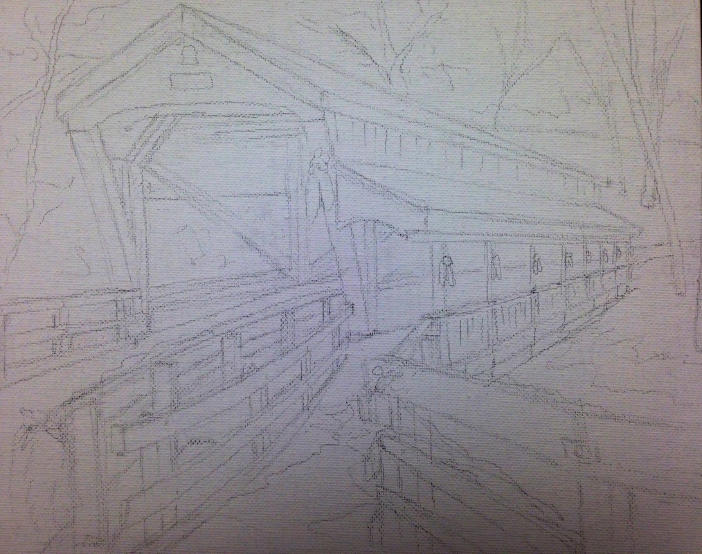 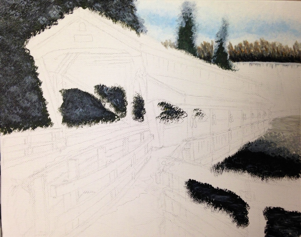 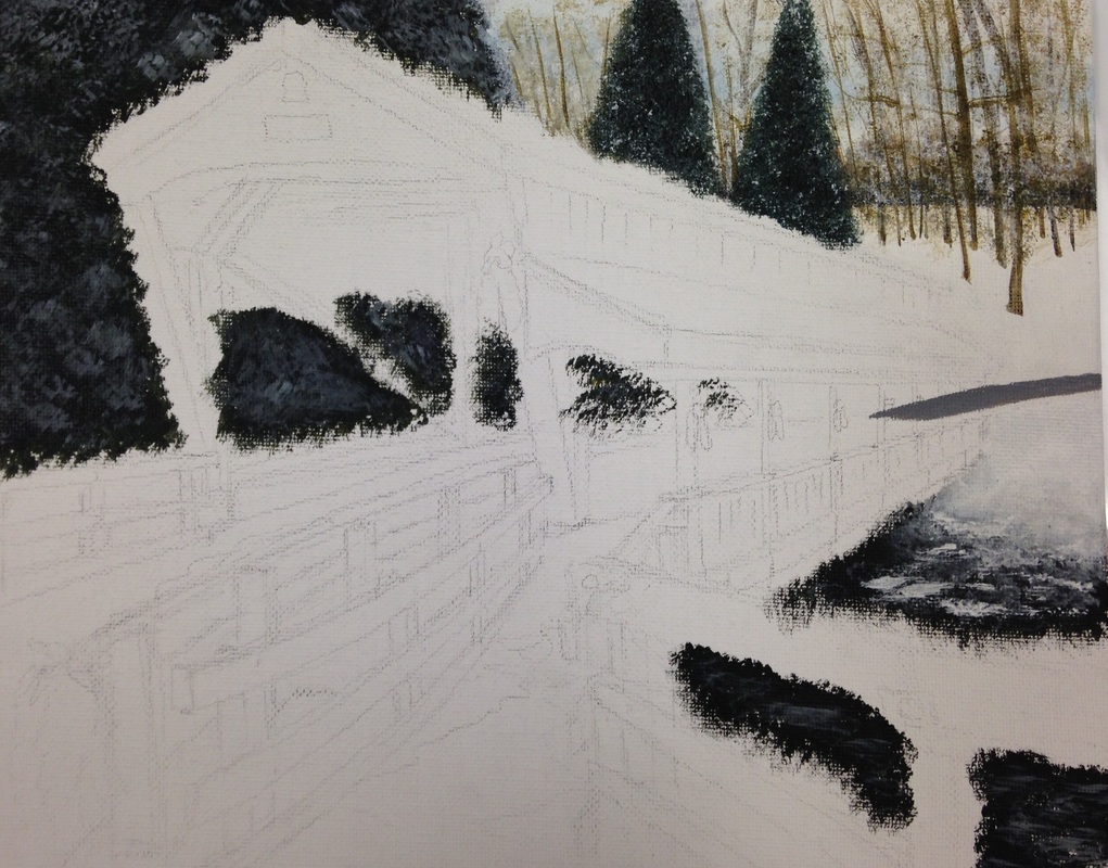 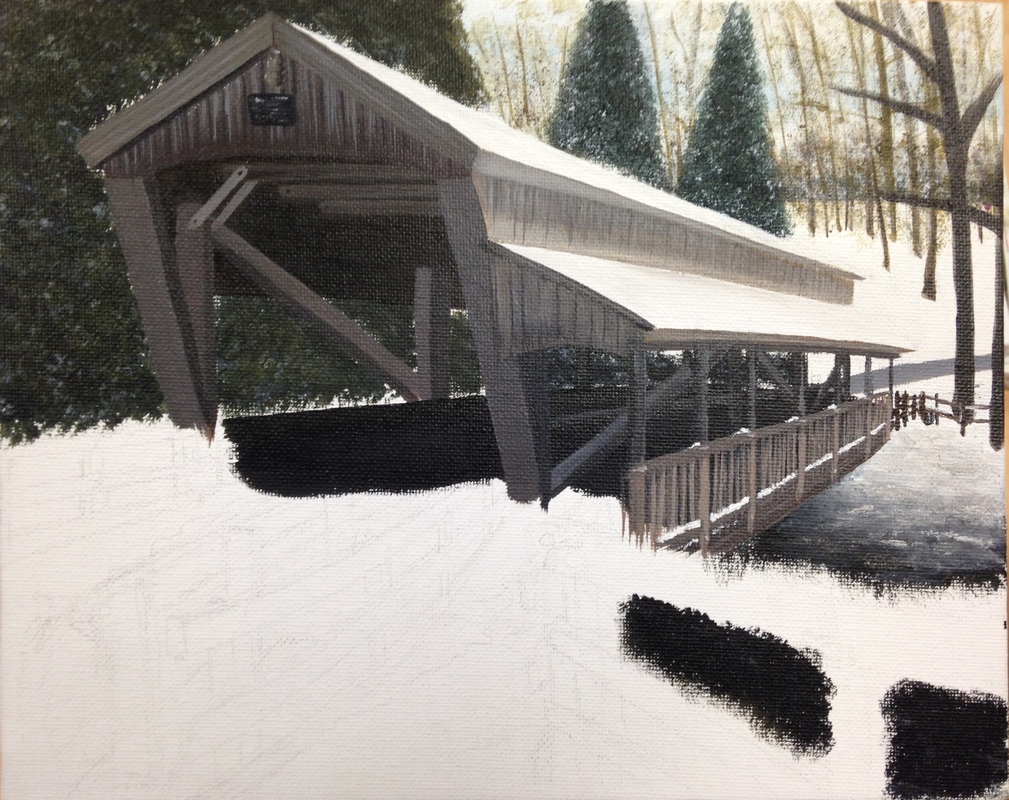 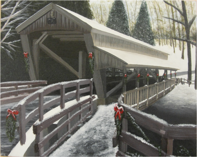 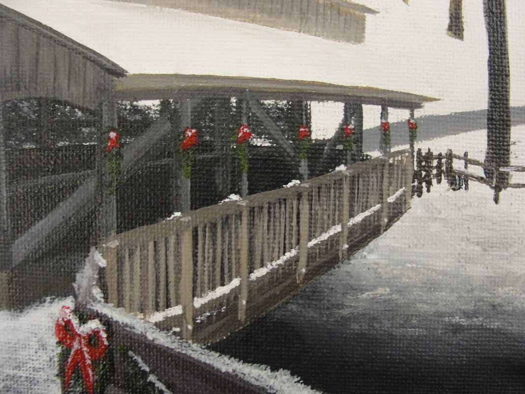 (More pictures to come <Progress>)
I very much enjoy working with acrylic paint. I haven't done a painting with acrylic in a good 3 years. I find this medium much easier to work with than oils because acrylic allows the user to layer (to fix mistakes) and it dries much faster. I was able to mixed wide varieties of colors to get the values you see in this piece. The biggest part about working with acrylic is the artist's skill in layering. Because of this feat, the user must create the background first, then layer on top the foreground. Without using this technique, (i.e.- painting the foreground first) the artist must paint around their foreground to make a background. This leaves margin for creating white spaces around the foreground, and the brush strokes will look bad. I had trouble keeping my color palette the same throughout the entirety of this project. In the reference picture I used, the colors were more vibrants and orange (in the browns). I didn't like that about the picture so I changed it up a little bit. I wanted this painting to feel like more of a fall-based piece. I felt this aspect would be achieved by darkening my values by adding a smudge of black to each of my darks, and add white to those same darks to create pale, lighter colors. I think this worked out well in my benefit, and the overall piece turned out good. To finish this piece off, I added wreaths with bright red bows to give direction and balance to my pale color palette. |
AuthorWrite something about yourself. No need to be fancy, just an overview. Archives
June 2015
Categories |
 RSS Feed
