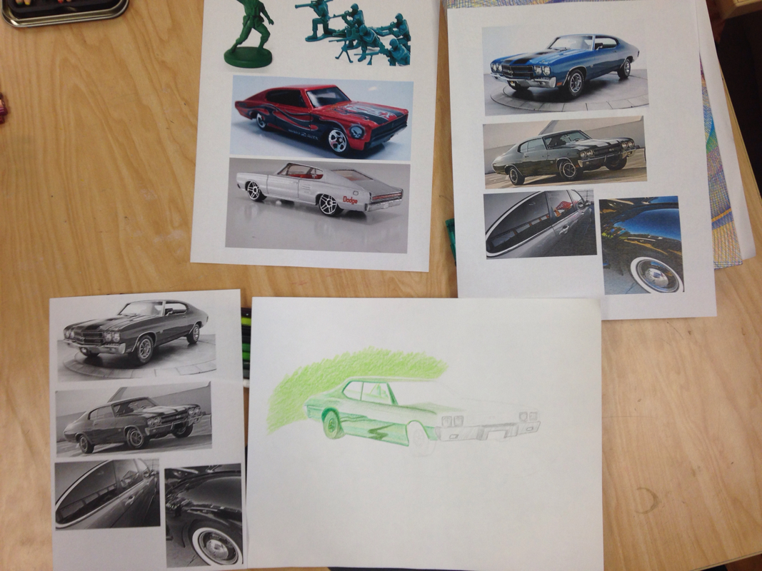
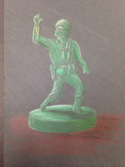
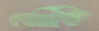
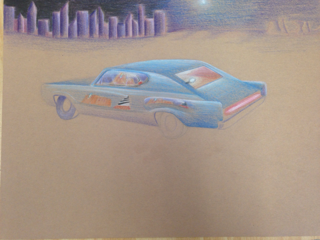
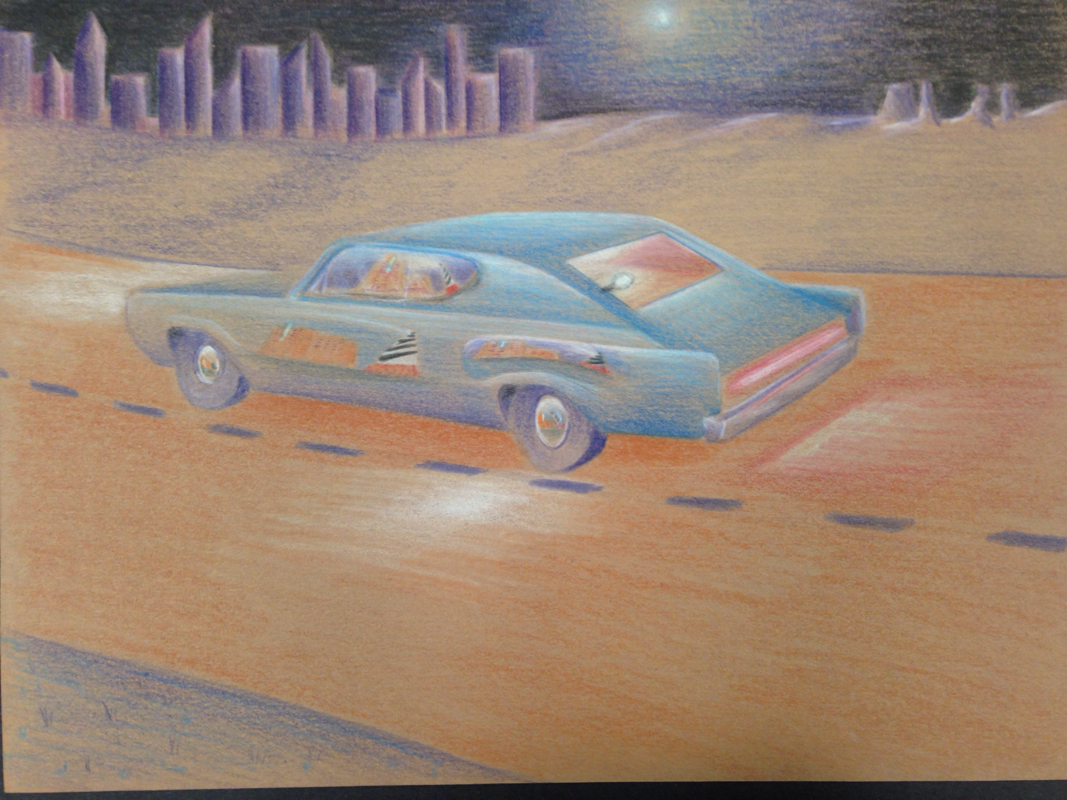
     This was my first project in Art 4, and I feel it went pretty good. I've worked with prisma-colors before, but this is my second piece. This project required having reflection(s) in the work that also describe the artist in some way. Not only that but we were supposed to pick a unique color pallet as well. I picked dark colors such as navy blue, violet, and pale red, but to make the reflections stand out, I used brighter colors to call the viewers attention.
As a child, I loved to mess around with "Hot Wheels," so I brought some in and found that I could use some of the reflections on it. This element in the piece describes my childhood. Another element I included was having the setting be night time. I love the night, especially when driving, it is very cool to see the moon light up the night and city lights reflecting the stars. Since cars are known to have distortive reflecting properties I thought this would present an interesting challenge for me. Those two things you see throughout the car are my two favorite vacation spots. One is the Cape Hatteras Lighthouse (OBX) and the other is a resort we visit every year in South Carolina (Myrtle Beach). I thought it would be cool to reflect them off different panels of the car like it was driving by them on the road. Overall I think this piece turned out pretty good, but it would still help to use this medium again in the future.
0 Comments
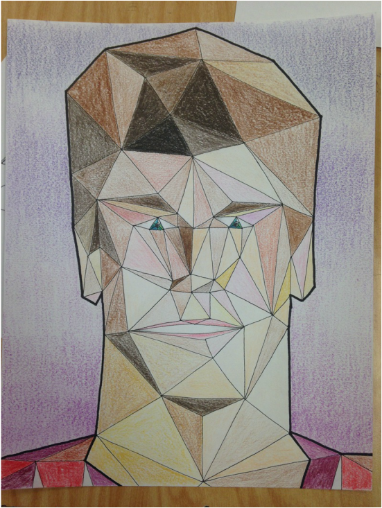 This subject matter for this project was portraiture. I chose to challenge myself by mixing up some of the concepts. In the picture, the viewer can clearly see triangles, which is the only shape used to make up the portrait. Through my reference picture I determined where to place the colors accordingly to make this look like me. This is very much like "pixel art" because up close, there isn't much of an image, but further back the colors arrange into an image. This concept was the hardest I could think of, due to the nature of how difficult getting the triangles in the right spot was. After all the line-work, it was just a matter of getting all the colors in the right spot. I also used a sharpie marker to make a thick line around the picture to make the image popm more. I really don't like working with portraits because the margin for error is too high. There are too many things to consider when working on certain sections of a face. I've done a few portraits before, and were decent enough to look like me, but I still find this as one of my least favorite subjects.
|
AuthorWrite something about yourself. No need to be fancy, just an overview. Archives
June 2015
Categories |
 RSS Feed
