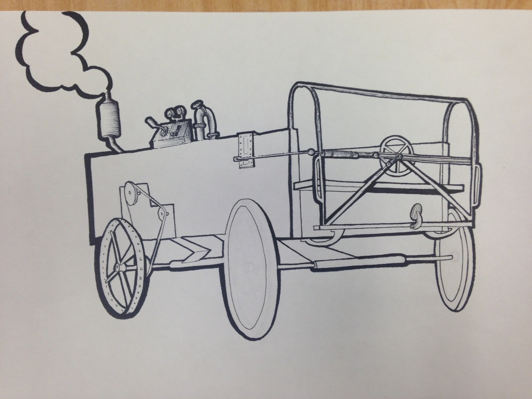
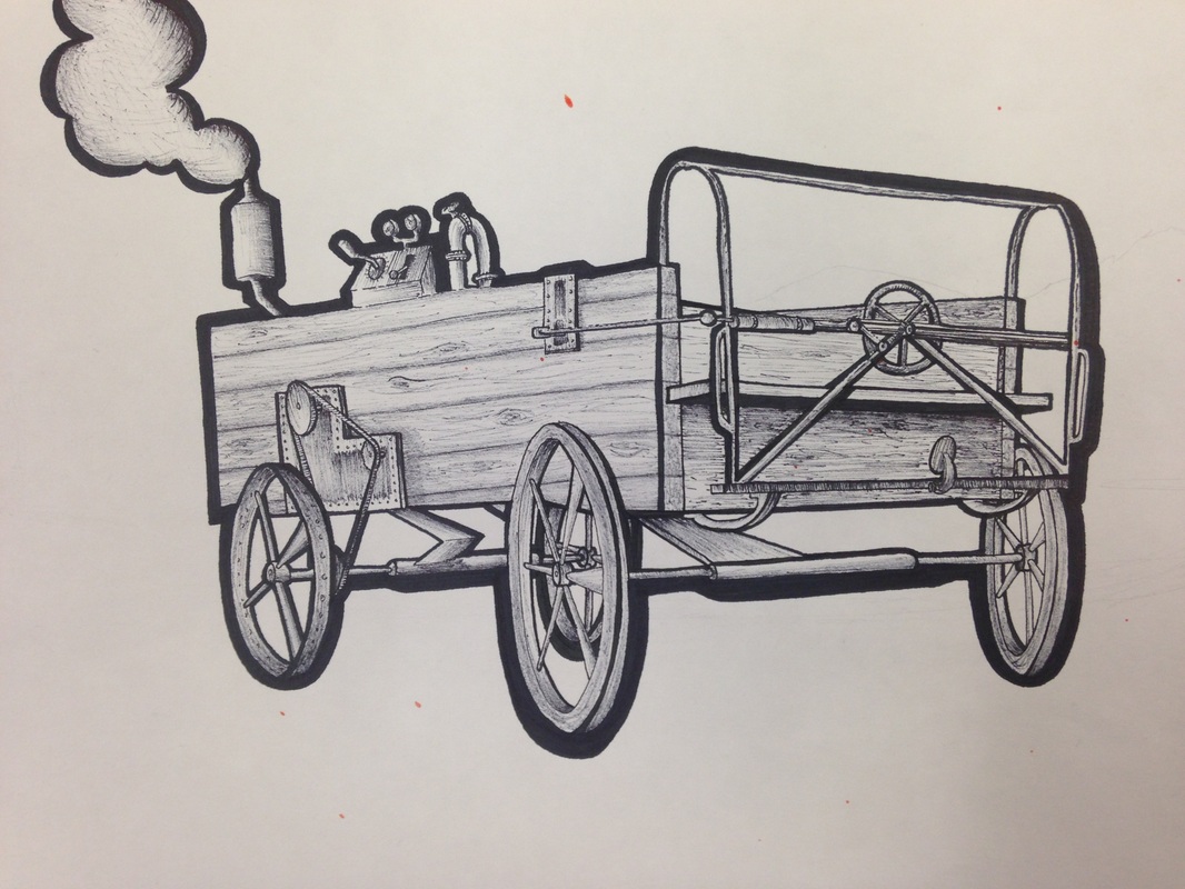
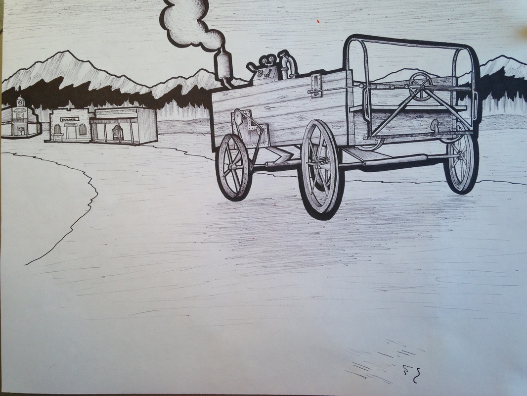
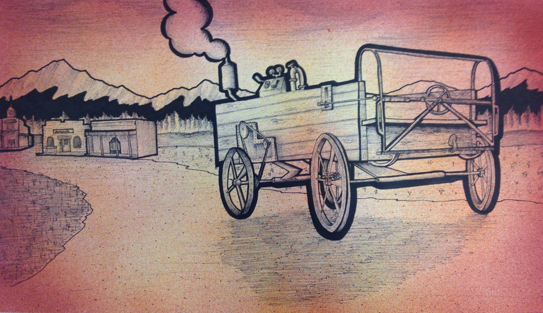
    This project represents a sort of "Juxtaposition" style art. This picture is supposed to be an old western type of media. I used fine tip markers as my media, and line as my technique. I really like using specific line work in my art pieces because it gives me more freedom to demonstrate what I am representing. My line work defines what I draw to give the drawing purpose in the eyes of the viewer. The idea of "Steampunk" might come to mind when one looks about this image. The wagon would not normally have an engine on it because of its time period. I researched some of the machinery used back in this time period (1890's) and found that the way I made the wagon looked uniform to that of other forms of technology. My experience throughout this piece was amazing. There is a grainy style filter on the final piece. This effect I created by using an airbrush after I finished all the ink-work. The only reason I used this effect was because one of my classmates splattered some orange paint on it by accident. This sparked the idea of making this image look as if it belonged on the side of a saloon as some sort of poster. The purpose for the lines in this project was for me to experiment with different weights and textures to make a photo realistic type of cartoon.
0 Comments
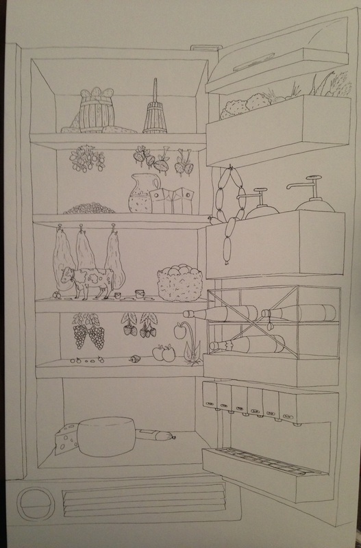 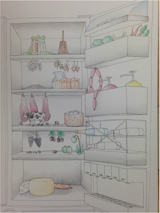 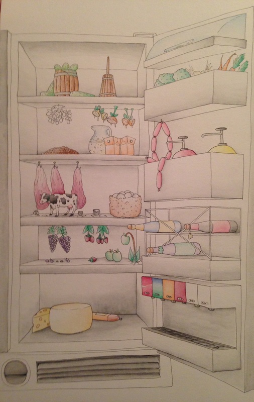 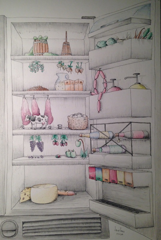 Working with watercolor is a great medium. This is my second time using this as a medium, but I think I am getting really good at this. I've learned that the water must be put on the paper first and then use little bits of color to create gradients. This idea of interior space as a project catches my interest in different ways to express my new theories of concentration. My idea for my concentrations is going to be revolving around "Representationalism." The way this will work as if I am redoing and image or idea as if it were something else. The cow in my picture is a good example. This cow represents "Milk" in the fridge. The viewer might also see other things in this picture that do not belong as well. The point to get across from this idea is to convey the similarities between different types of media. I am looking forward to working in this media again. I am already getting better and better at watercolor, even though I have only just been introduced to the correct methods of using it.
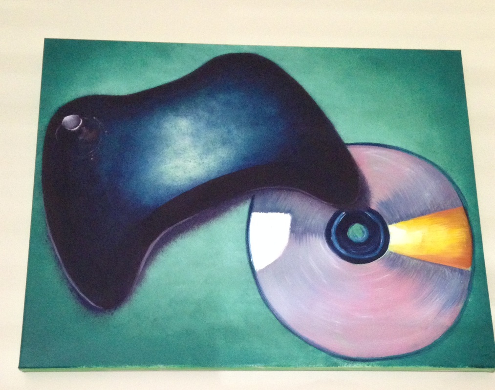  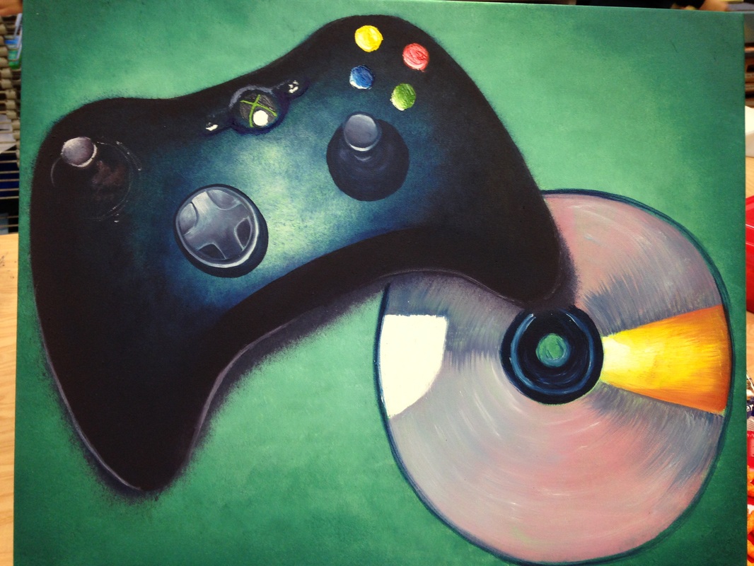 This project sparked my first freestyle oil painting. All the other oil paintings I've ever done were of landscapes, and with the guidance of a teacher-led class. When gathering the references for this painting I noticed that there were lots of dark and light values that I could try to manipulate. There were also many black areas in the pictures, so I took them into Photoshop and changed the colors in the picture to turn black into blues and purples. The HARDEST thing about this project was to paint an ellipse correctly. I will correct this soon, but the CD in the picture had a weird ellipse to it. I am normally very good at capturing the perspective of things, but I really need to work on ellipses. This was a very challenging painting to get the values right because oils take so long to dry, therefore the bright colors and highlights have to be painted first or else the darks will blend them and mess up the entire painting. I found it very interesting that oils give me the freedom of manipulation throughout working with shadows and blending. All the smaller areas I used a pallet knife because they were too small for paintings with a brush. The overall turnout of this was good, but I still need to fix the CD, which I made an ellipsed stencil to put on when I'm ready.
|
AuthorWrite something about yourself. No need to be fancy, just an overview. Archives
June 2015
Categories |
 RSS Feed
