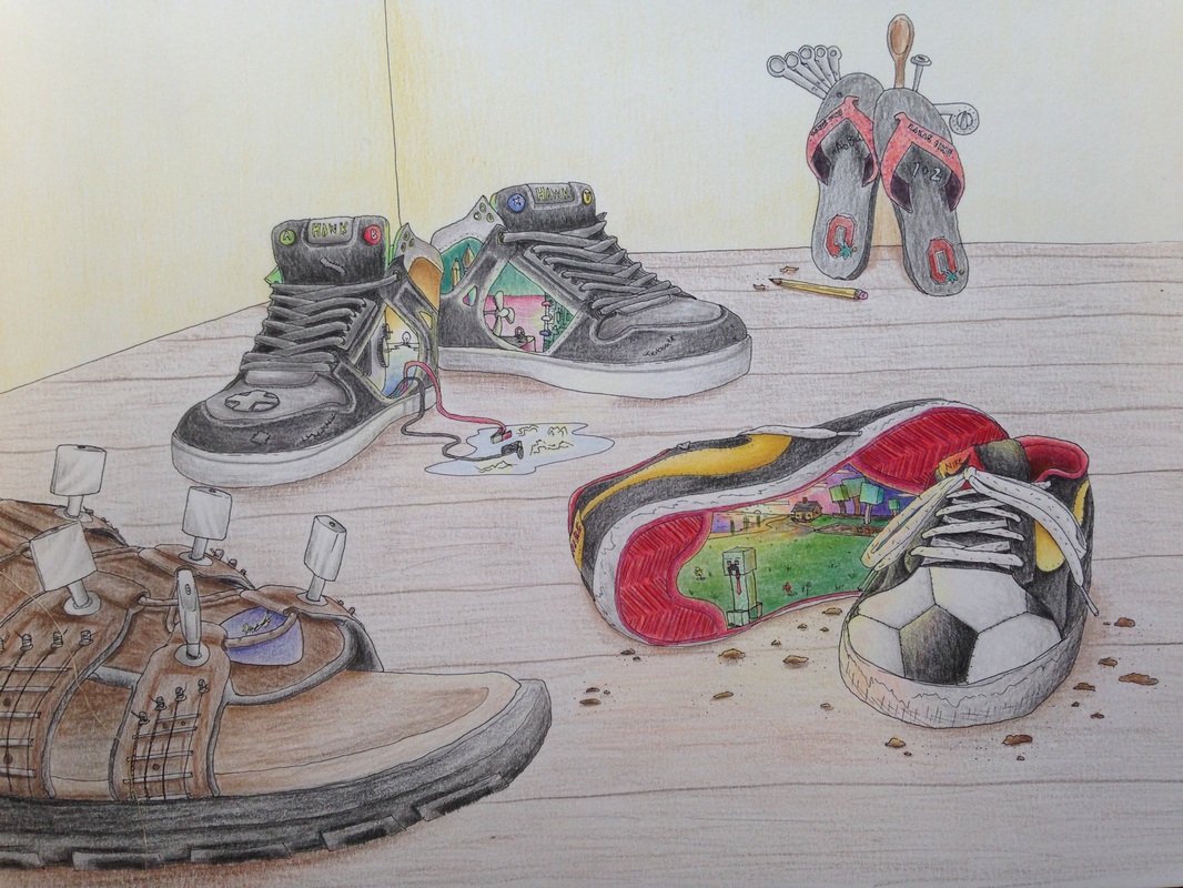
 This shoe project was my favorite out of all these projects. It gave me time and experience to further my understanding of colored pencils. I used Fantasia colored pencils to color it, and small pens for the line work. This was a great project to help me with my shading and highlights with different objects. I thought the shoe project was a great opportunity to show my skills in representing my family. Not only that, but I was the only one in the class to do this project. Each of the shoes represents a different part of each of my family members. I think it is pretty easy to tell what each person does in my family/what each one represents. 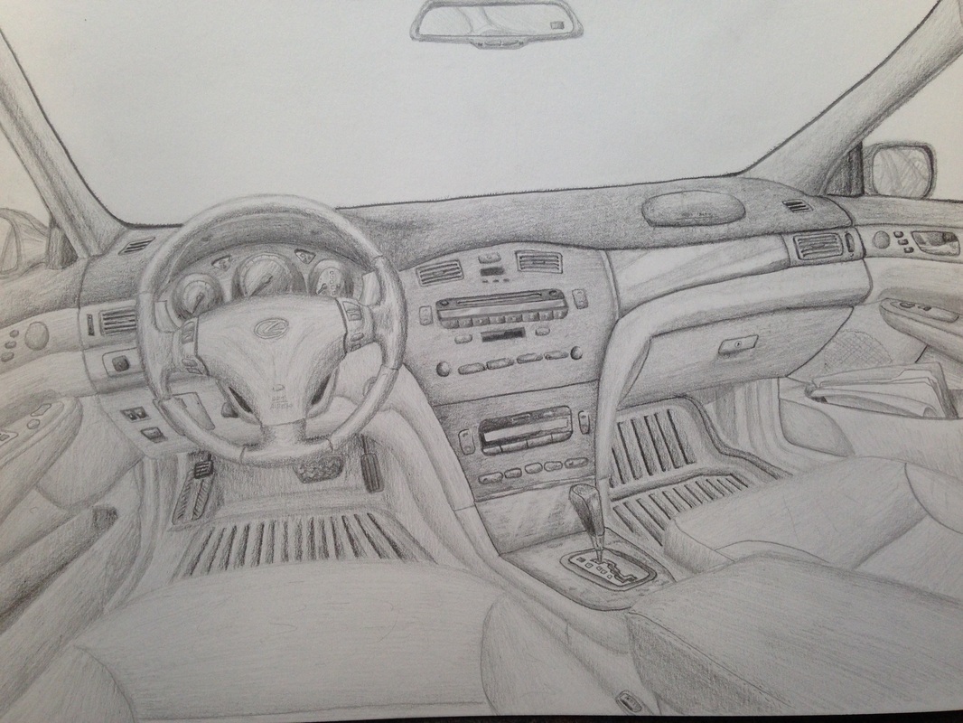 Using pencil can be easy and hard at the same time. Pencil is all about value. I've been drawing and shading for years so I know my way around a pencil. Anyways, this project was all about the inside of my mom's car. I used only a pencil and the inside of my mom's car. The reflections in some of my value of shading was the hardest part of this sketch; not to mention getting the proportions right. All I did was sit in the car from time-to-time for an overall amount of about 30 hours trying to perfect this thing and get it prepped for school. This was probably my longest piece that I took extra care of. I like how it has a slight distorted look to the perspective. This element adds into the surrealism of the art. 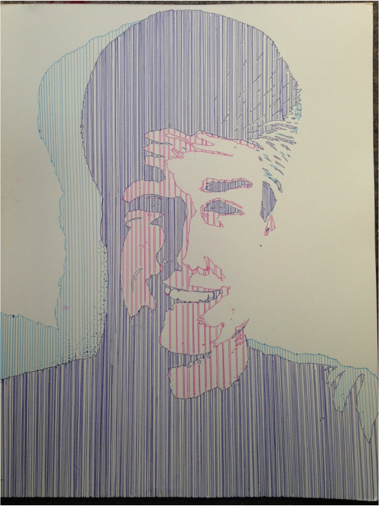 This is an interesting self-portrait I did using different colors of pen. I took a picture and manipulated the color value of it, then increased the saturation, along with some curve adjustments. Then I looked at the image and decided to make it interesting by only having one direction of lines. I used a long ruler as a guide and gave each color different line weights in a sense to change the way you see the picture from afar. The darker colors are closer together than others so that they are visible from far away. I like the way it turned out, and it helped me get a grasp on color manipulation between values in order to achieve a certain POV in an art piece. 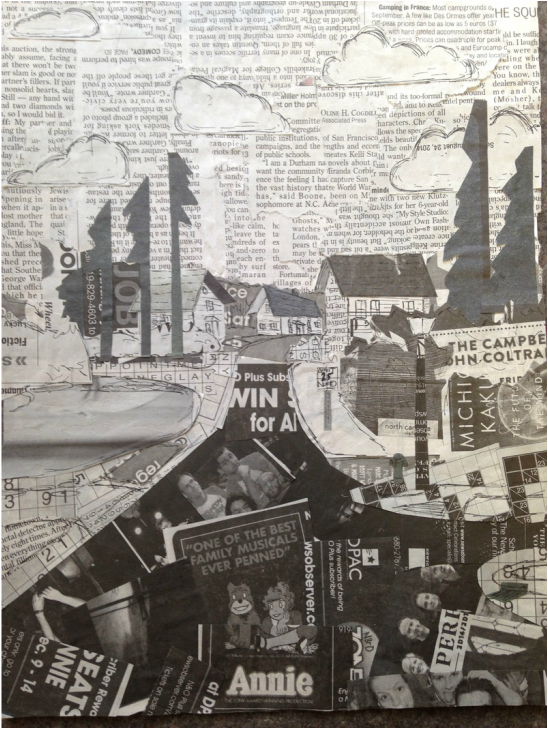 This is an image I created using scraps of newspaper. It is an image that is supposed to be overlooking a street in my neighborhood. I took a picture and discovered the values hidden throughout the image. I then cut up newspaper, and sorted out the ranges of values from black to light gray. I then planned out where to put the pieces, and once I did I glued them on top of a sketch I had of the photo for placement purpose. After I was done gluing the pieces I drew on it with pen to add more details that I couldn't add with the newspaper. I think it looks very similar to the street in my neighborhood. This was my first newspaper collage type piece that turned out pretty good. 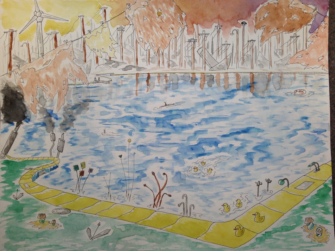 Using watercolor is a hard skill to master. Unknowingly, I forgot that with watercolor, the paper needs to be wet BEFORE the paint is applied. I missed that step, but I think this piece turned out good enough. This was my least favorite out of the five I did for summer. One of the reasons why is that the watercolor did stuff I didn't want it to do. This was my first real watercolor project, although I've worked with it in small amounts in the past. This is an image of a "Materialized nature" of the pond in my neighborhood. Most people don't see this, they see a yellow-brick road of some sort. I can see that, but it is SUPPOSED to be a swimming pool, along with other elements of nature that are represented in other ways
0 Comments
|
AuthorWrite something about yourself. No need to be fancy, just an overview. Archives
June 2015
Categories |
 RSS Feed
