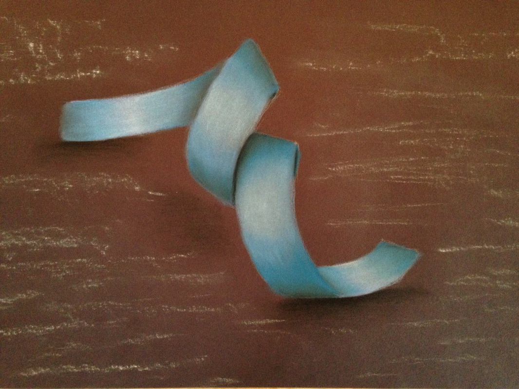
 Drawing and/or shading highlights on certain objects can be tricky. In this piece I used Prisma-colored chalk pastels to make this paper ribbon. The main trick for prisma colors is to mix colors you wouldn't normally mix to achieve an even greater affect. This style will also be shown in future pieces as I work with this medium.
To get the basic shape of the ribbon I first draw the contour of the ribbon with a chalk pencil, very lightly. After this I pick a color I want my ribbon to be and I start coloring. After a light coat of the basic color I then take a darker color of that shade and look at where my dark spots are. Once I've shaded the darker areas I push my lights and my darks. In this case I added some white where the spotlights hit the ribbon, and then black where the shadows were. To finish the piece I blended all of the colors to create a smooth transition between shades.
0 Comments
Leave a Reply. |
AuthorWrite something about yourself. No need to be fancy, just an overview. Archives
May 2015
Categories |
 RSS Feed
