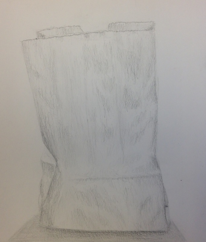
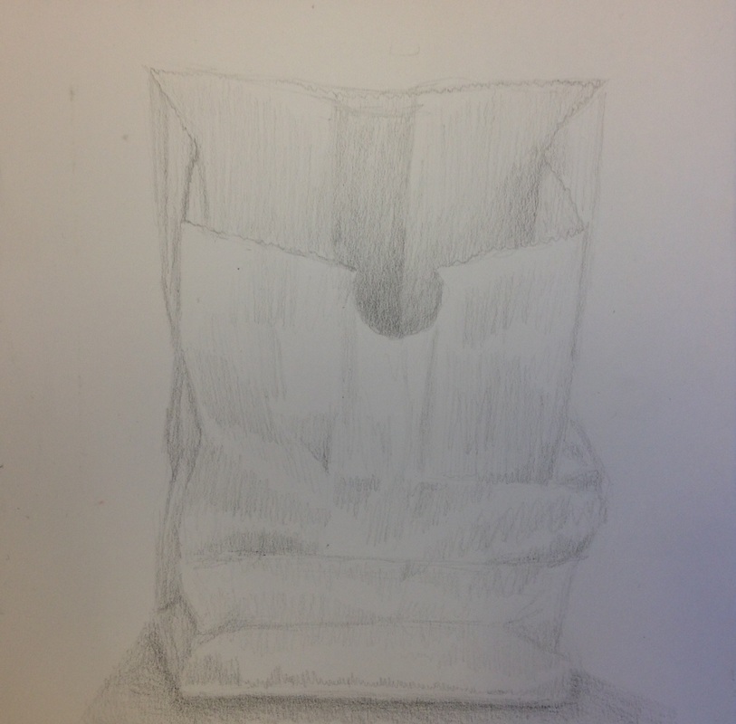
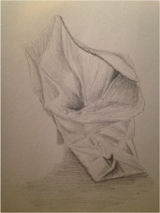
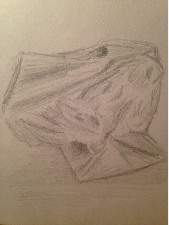
    I chose to draw a brown-paper bag progressively getting smashed. Everyone else drew the Hershey kiss, and I already drew a well-detailed kiss. The paper bag is interesting because the shadows are similar to that of fabric. The shadows must be placed accordingly, or else the drawing will fail to look like a bag. The difference between the paper bag and fabric is the lighting is more distinctive and shadows not as dark. Folds of fabric create nice dark shadows, however, paper has minor folds that create tinted shadows and blotches of shade. This is much harder to accomplish because shading the bag is like making smooth gradients with the pencil. After evaluating the aspects of the piece, I feel that the paper bag is an overall good still-life object to work with. Shading it has taught me to use better methods when using pencil so I can make my shadows more realistic. The more the bag gets crushed, the easier it is to capture the shape and shading.
0 Comments
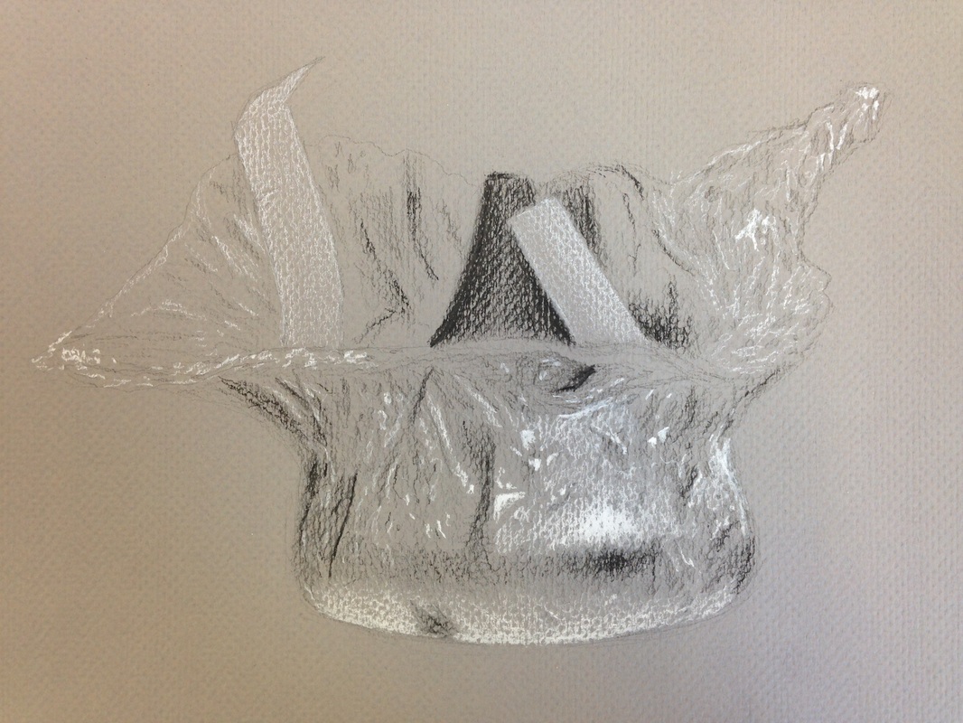 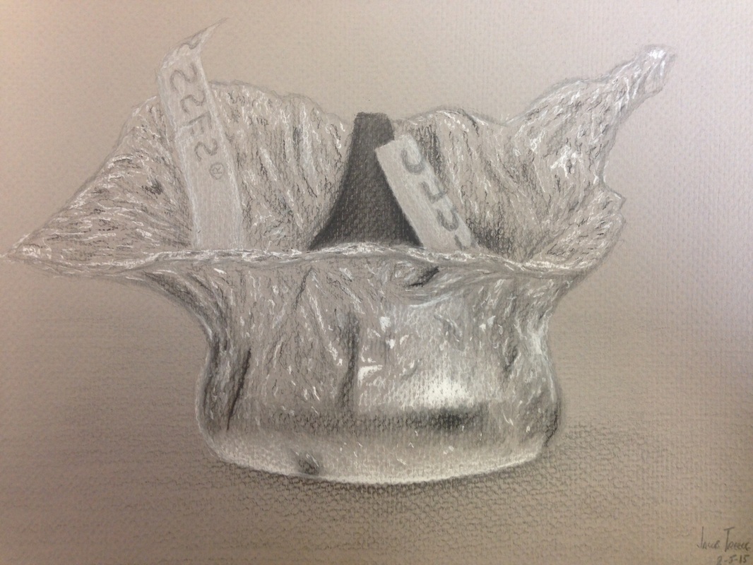 Here's a Hershey's kiss being unwrapped that I drew with a variety of charcoal, and some pencil. I drew this on gray-fiber paper so there is texture in some areas. The difference from the first and second image is the blending I did. After blending some of the black areas, I felt that there wasn't that "metal" effect was looking for. I continued to blend and decided to layer more charcoal on top of those blended areas to define them properly. This gave the perfect touch of a "foil" aspect and it looks almost real now. If I had to touch up anything it would have to bee the wrapper ribbon because it doesn't exactly look like a paper ribbon.
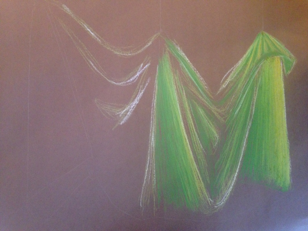 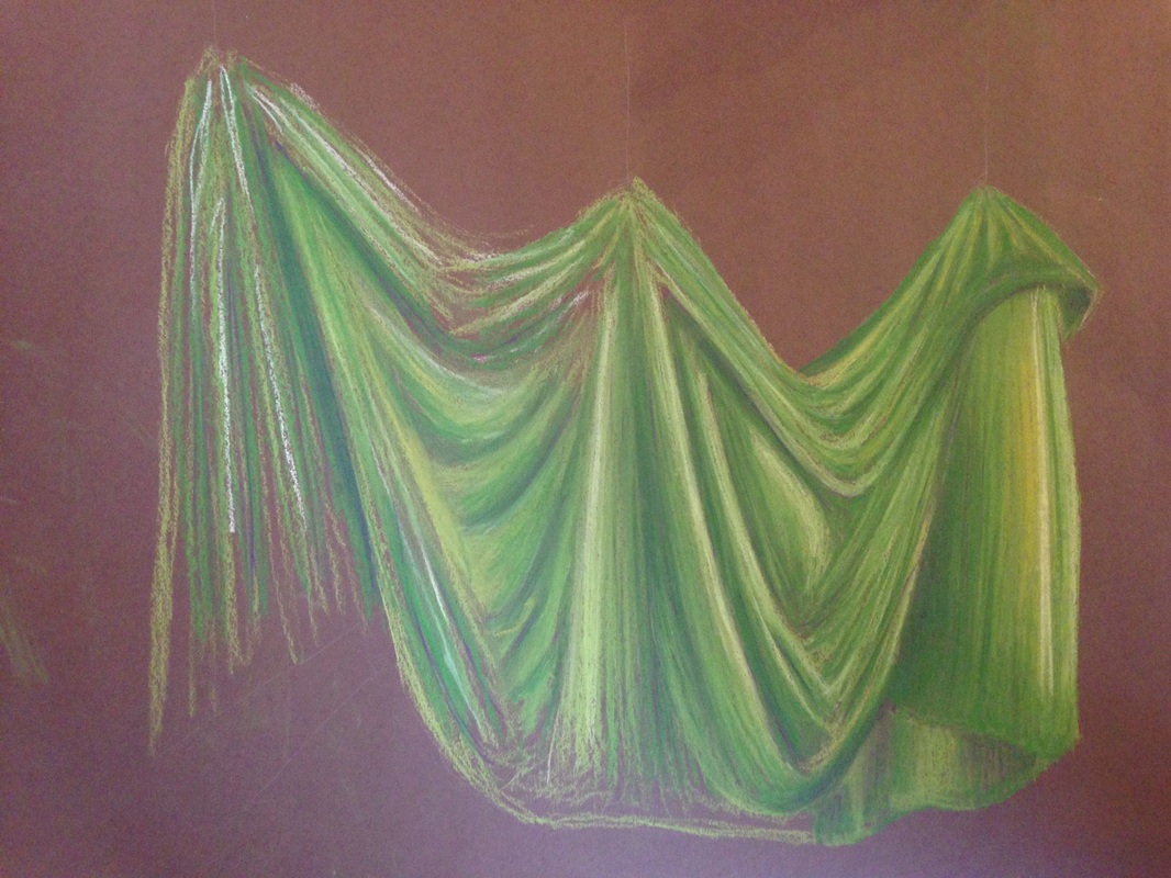 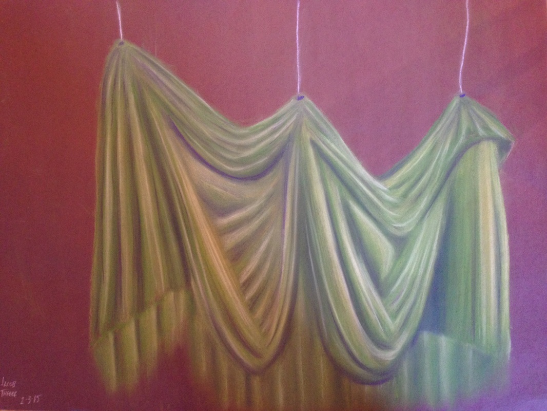 Mixing in different colors really does make a big difference, especially with prisma colors. There is a major difference between these first two images, can you tell? In the second image there is purple in areas that are very dark, however the first image only has shades of green, with tads of yellow. The difference is amazing, and the mixture makes the piece almost come to life. I am so glad I took Mrs. Rossi's advice. The deep purples work complimentary towards the greens and creates the illusion of a shadow. The deep shadows working against the bright highlights really emphasizes the image of fabric to the viewer.
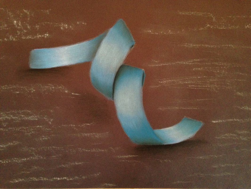 Drawing and/or shading highlights on certain objects can be tricky. In this piece I used Prisma-colored chalk pastels to make this paper ribbon. The main trick for prisma colors is to mix colors you wouldn't normally mix to achieve an even greater affect. This style will also be shown in future pieces as I work with this medium.
To get the basic shape of the ribbon I first draw the contour of the ribbon with a chalk pencil, very lightly. After this I pick a color I want my ribbon to be and I start coloring. After a light coat of the basic color I then take a darker color of that shade and look at where my dark spots are. Once I've shaded the darker areas I push my lights and my darks. In this case I added some white where the spotlights hit the ribbon, and then black where the shadows were. To finish the piece I blended all of the colors to create a smooth transition between shades. |
AuthorWrite something about yourself. No need to be fancy, just an overview. Archives
May 2015
Categories |
 RSS Feed
