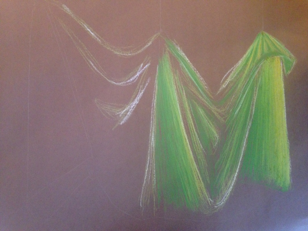
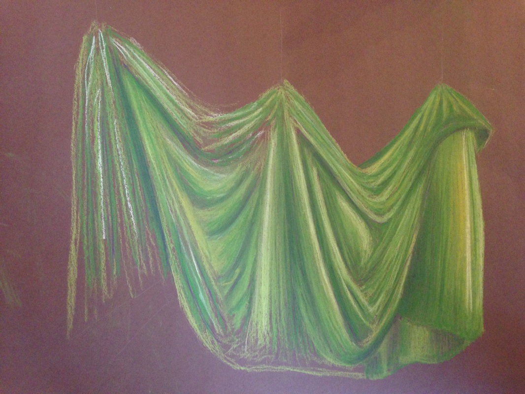
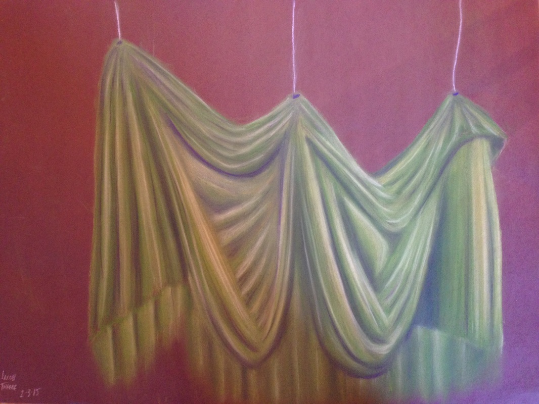
   Mixing in different colors really does make a big difference, especially with prisma colors. There is a major difference between these first two images, can you tell? In the second image there is purple in areas that are very dark, however the first image only has shades of green, with tads of yellow. The difference is amazing, and the mixture makes the piece almost come to life. I am so glad I took Mrs. Rossi's advice. The deep purples work complimentary towards the greens and creates the illusion of a shadow. The deep shadows working against the bright highlights really emphasizes the image of fabric to the viewer.
0 Comments
Leave a Reply. |
AuthorWrite something about yourself. No need to be fancy, just an overview. Archives
May 2015
Categories |
 RSS Feed
