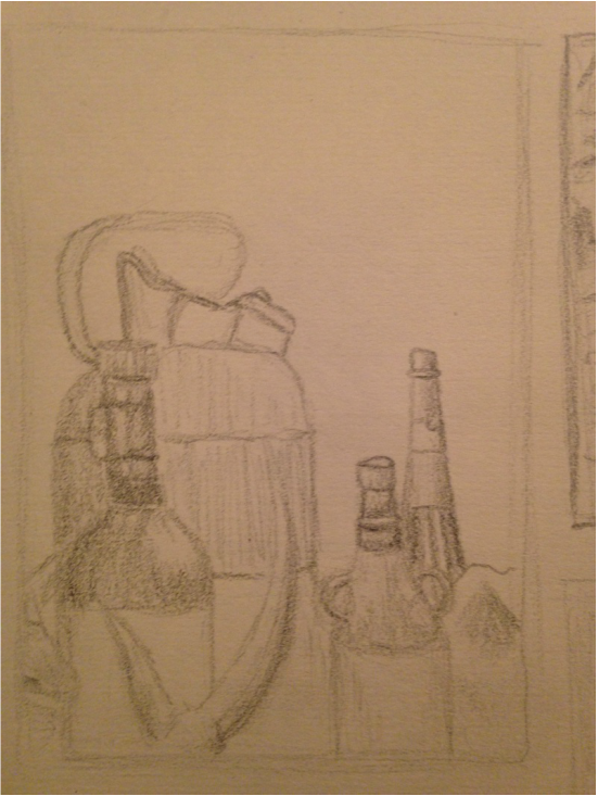
This is a still life picture made from black & white charcoal pencils. All these objects are things brought in by one of my fellow classmates. This really helped because the array of things she brought really widened our view of choices. The basis for this project was to pick a still life section to draw, but also have an interesting placement to the picture so it would look right.
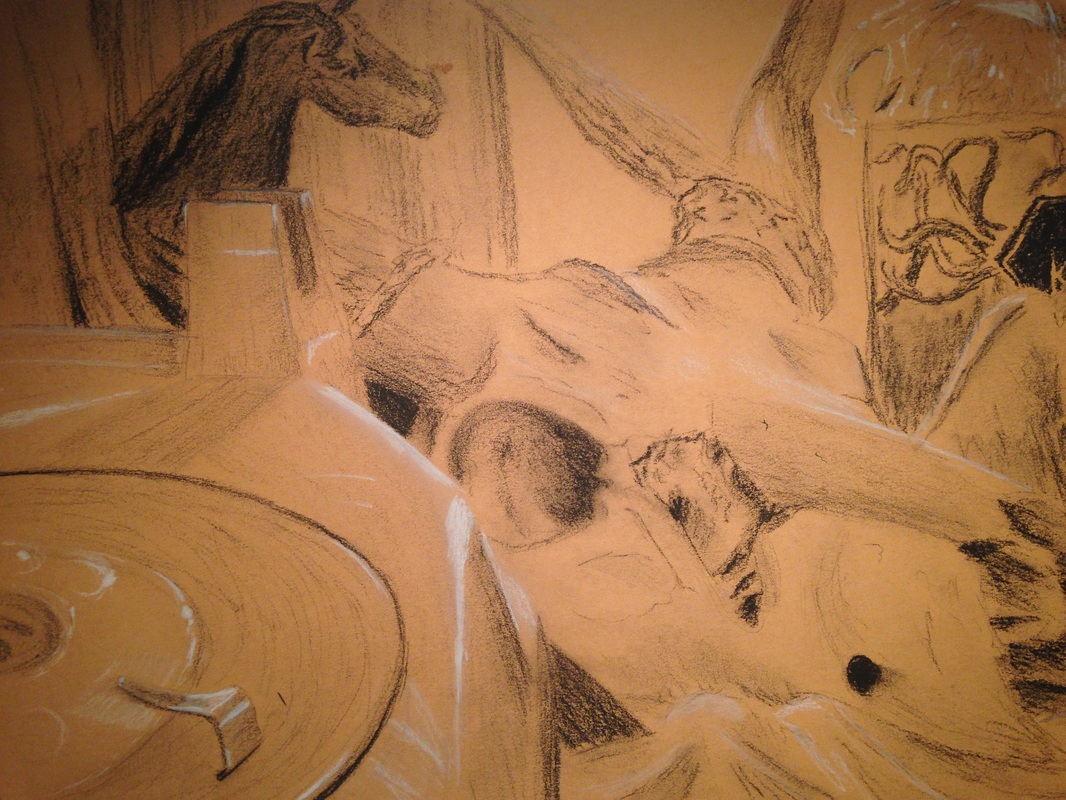
I like charcoal because it is one of the easiest mediums to achieve dark values with little effort. Since pencils are grey, and charcoal black, pressing down on the charcoal the same you would a pencil, results in much darker strokes. The problem with this medium is that charcoal has a tendency to smear on the paper if you're not careful. Another thing is that where areas of light shading need to be made, the user must carefully apply the charcoal so that the value is not to dark, and the strokes are not defined (smooth). The upside to charcoal is blending. Of course this is optional for the user, but blending with charcoal is as easy as smudging with your finger. Pencil, on the other hand, needs to be blended using a tortillion/other tools. Pencil can be blended with the finger, but if the user needs to erase, it will be harder to make the marks come out of the paper because of the oils from your fingers. I like the turnout of this picture, it just seems weird sometimes having bits of negative space when the rest of the photo is crowded with objects. I guess that's why this 'placement' rule is so important, otherwise the viewer could either become distracted or bored with your art. Charcoal has helped me control my sense of value, and make me less scared of going dark. Exaggerated shadows that are super dark are often times better than the actual picture. This effect stresses realism and emphasis to the viewer, which creates a better atmosphere for the piece.
0 Comments
Leave a Reply. |
AuthorWrite something about yourself. No need to be fancy, just an overview. Archives
May 2015
Categories |
 RSS Feed
